Subliminal Ads
in Super Bowl 2023
Subliminals in Super Bowl 2023
Quick Jump Guide
Part 1: Force
Daytona 500
Next Level Chef
Fox Nation
WWE Friday Night Smackdown
Bordas & Bordas (Law)
Womens’ Flag Football
Coors, “High Stakes Beer Ad”
Part 2: Connection
Budweiser, “Hold”
Budweiser, “Six Degrees of Bud”
RAM, “Honor”
McDonalds, “Knowing Their Order”
Farmer’s Dog (pet food)
T-Mobile, “The Rewrite”
Patriotism
We come pre-packaged with a propensity for Patriotism. It is very powerful and rouses from our deep ancient patterning. A skillful advertiser can evoke and light us up with it. By it’s nature, it is rallying, enough to get people to march into war despite great cost to self and family. It is unifying and seeks to bring in more of itself. When Patriotism is evoked, we may opt for lesser products with elements of our flag. We may even be outright disgusted by a high quality product with elements of our enemy’s flag. From an ad perspective, what is a flag other than branding?
Patriotism by its very nature creates an in-group. Unfortunately, that necessitates an out-group. These are people outside our borders, who should not share our resources, and aren’t lockstep in our ideology. With this in mind, you would expect to see these things in more stringent/fervent forms Patriotism: (a) talk of immigrants, usually paired with invasion, disease, or defilement rhetoric; (b) a more formidable barrier at the border both physically, legally, and with higher repercussions; and (c) more likely to cast out a fellow citizen for not being ideologically pure enough (e.g., “Un-American” “If you don’t like it you should leave the country”).
The out-group aspect of Patriotism isn’t really played by commercials. The products mostly flash a subliminal to let the patriotic know it is part of the in-group and should therefore be preferred.
FOX stands out for the sophistication of its subliminals and the extensive use of them. You’ll see as we go through it. They also stand out for having sweeping hours of access to their audience, being a network. If one is in to branding, this is goldmine! The FOX’s brand, as far as subliminals go, is Force and Patriotism. With that amount of time and sophistication, you wouldn’t be surprised to see in their audience a bigger share of gun enthusiasts, big truck owners, flag bumper stickers, and political clothes as part of daily apparel. Note how 2nd Amendment rights has a beautiful overlap between Force and Patriotism. Going along with brand theory, we would expect such an audience to reject competing brands. Perhaps the “lamestream media” slur is a part of that. (Let’s keep our politics in our pocket. We are *only* looking at this from an ad/subliminal perspective, which doesn’t give the full picture).
Budweiser, through its earlier history, really pushed the Patriotic. Their logo featured an American eagle holding arrows in its claws while inside the letter “A.” They put the word “America” right on the front of their medalion. Their colors were often red, white, and blue. They’ve made specially designed patriotic cans for the World War. They keep a thread of Patriotism active, but they’ve been pushing Connection as the prominent brand for decades.
Subliminals largely attract those who already have those systems well-developed in them. However, with enough time and exposure, subliminals can shape and create us too.
It’s rookie stuff to just hide a flag on the screen. We do that, of course, and we can make it far more subtle so that you won’t consciously recognize it looking right at it. One trick is to disperse the flag over a space. In a drone shot over a city, we might taint some lights so there are red in one area, blue in another, and white over there. Perhaps we’ll put some stars in there but have that be street lights or lights from office windows. We may find parts of the street or building walls to get some stripe effect in. You get the idea. One doesn’t need every element present to evoke the flag.
The terminology I’ll use here to distinguish between an actual flag and a non-obvious flag is “actual flag” or “overt flag” and “subtle flag.”
For reference later, each second of video is 30 frames. There’s a great deal of split second work done in flashing subliminals at you.
Patriotism #1: (FOX) FOX Nation
This is an ad for Fox’s online tv streaming service. It’s about $6 month. We also covered this one under Force subliminals. Patriotism subliminals are in practically every shot. Two versions of this ad were played. One is so flagrant that I don’t need to describe it. Seeing it first helps understand the more subtle arguments in the second ad. In most moments you are washed washed upon by thought-conforming hidden persuasions.
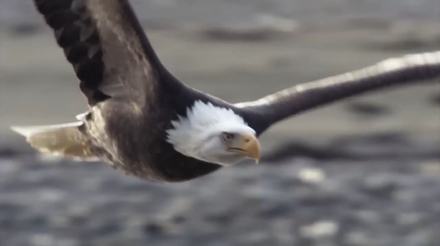
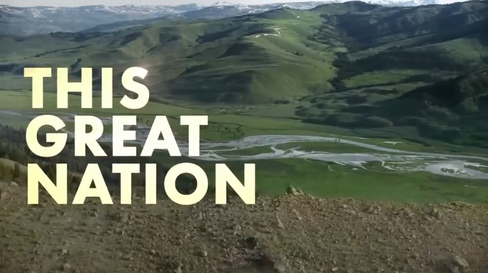
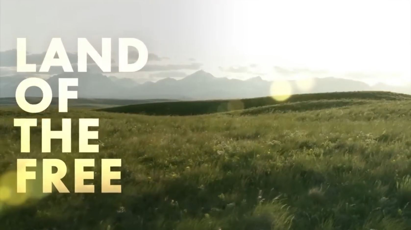
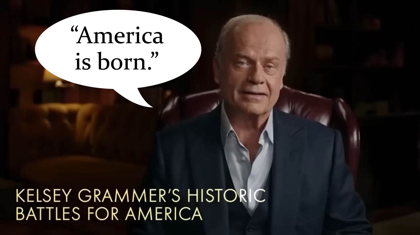

Now we begin the second ad. It’s more subtle. It doesn’t have text literally reciting the national anthem. It doesn’t write “America” a number of times on the screen. However, it will show an eagle, the very symbol of America flying in a nature documentary. Further shots from the show on our national parks don’t need to be labeled “This Great Nation” for our unconscious to receive the signal.
Shots #1 & 2
Shots #1 & 2


The director starts with a bang! We get an extreme close up of an American eagle in flight. His wings expand beyond our already huge tv screens. It is a core symbol of America. So from the very first frame we are hit with a strong shot of Patriotism.
The second shot continues this imprint with the American eagle now perched dominantly upon a tumbled tree. He is cawing powerfully into a snowstorm.
Here’s a way to know if you’ve been infected by the subliminal: did you know what I meant when I said “American” eagle . . . because that’s not its name. Why didn’t you think of another bird, like a turkey? By the way, did you know Benjamin Franklin wanted the national bird to be a turkey? He said the American eagle had “bad moral character” because he “steals food and is lazy.” How do you feel to have read that? If you are in any way offended by it, you may be imprinted by Patriotism.
Shot #3
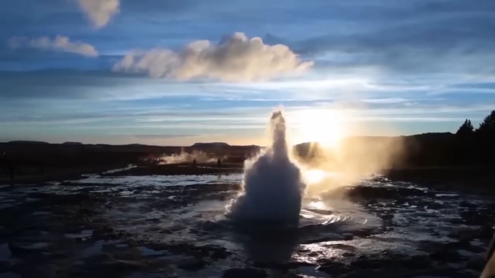
We are brought to a National Park (Patriotism), and a geyser immediately erupts, symbolizing the force of America. It’s like the military jets at the start of the Daytona 500 race car ad. (Discussed later here)
Shot #4 & 5
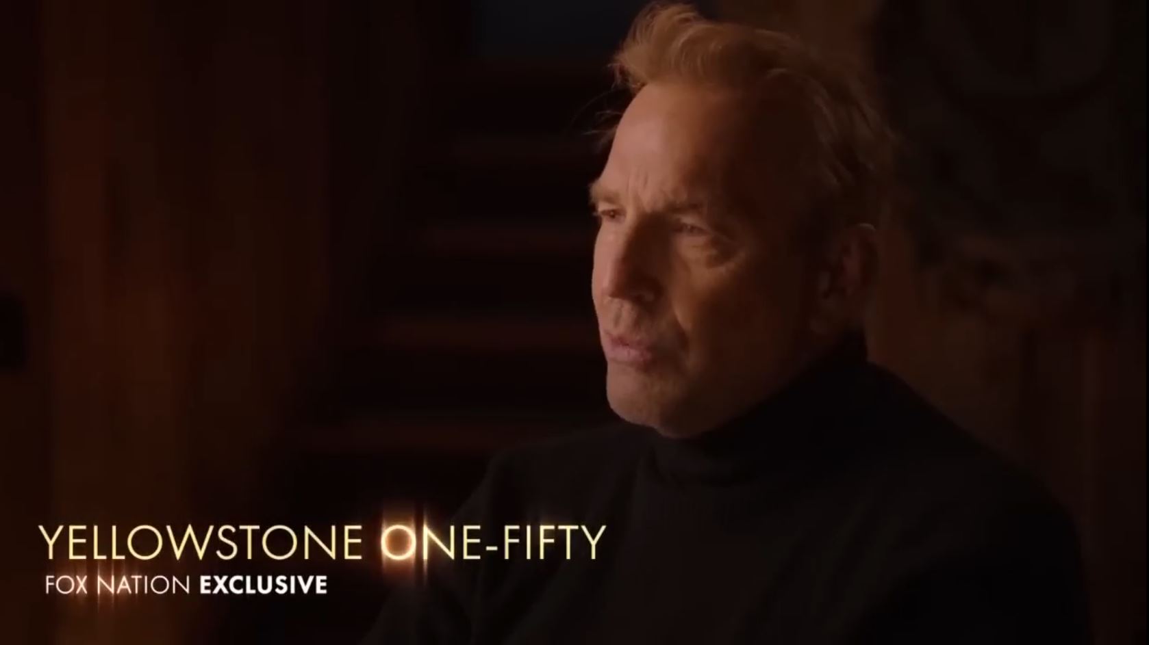
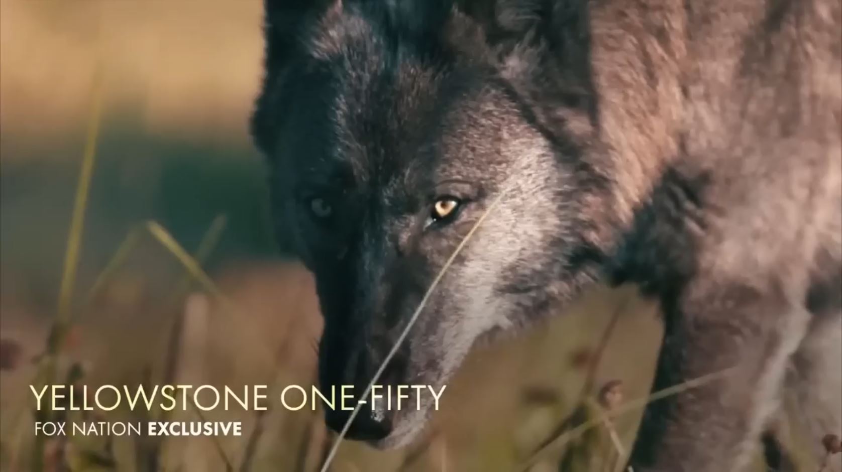
This subliminal can be interesting because it relies on the prior priming to work in a few instances. Kevin Costner appears on the screen. Famous for playing a Civil War soldier in “Dances with Wolves,” he pings a light Patriotism just by his appearance.
He is currently in a scripted tv drama called “Yellowstone” on a separate network. That’s different than this show “Yellowstone 150” which is like a nature documentary by FOX. You can bet Costner was selected precisely because of his connection in your brain. That makes his image alone a double-stacked subliminal. They even show the word “Yellowstone” in big letters. By evoking what Costner is attached to, they get to piggy back on the good will and imprinting by done by others. It’s cost-efficient, if you think about it.
The more interesting “prior priming” effect we get is when Costner says, “I want to see what they see.” We don’t know who he means yet, so our brain guesses as best it can. It was just primed with two examples of American eagles, an American national park, and a US Civil War soldier. Your brain is most likely to come up with a predetermined answer at least some place in that realm. Before your answer can come to conscious awareness, the director flashes you to the next screen. This is a really artful thing which I also do in my hypnotherapy sessions. Clients can ruin an effect I’ve been building if I let their conscious mind think on it for too long. Honestly, sometimes one second is too long. So I land a suggestion, perhaps posed as a question, and then pull them off it to some adjacent related topic. My suggestion kicks around in their head affecting emotions and behaviour while they think about something else. I see a lot of similarity here. The rhythm was quite beautiful for it too.
The next screen it flashes to tells us how to feel. In Yellowstone, we see a wolf with striking golden eyes moving towards us in a predatory advance. The eye is so striking and practically glowing. Less than a second ago on the previous shot, the “Yellowstone” capital “O” was glowing too, just like the wolf’s eye now. Most viewers probably won’t be aware of the guttural growl that’s hidden in the noise. It took me about dozen watches before I found it. As it slips by the unconscious unhindered, it can help generate feeling more easily.
Shots #6-8
These are the Duck Dynasty shots. I don’t make too much of this subliminally. There’s an argument for a mini-dip into our childhood memories of digging for treasure. Dips into childhood can be useful for work with the unconscious. A remote connection can be made to American history class with the Gold Rush of ’49. Not everything is a subliminal, even if you can make the connection. The next shot, however . . .
Shots #9 & 10
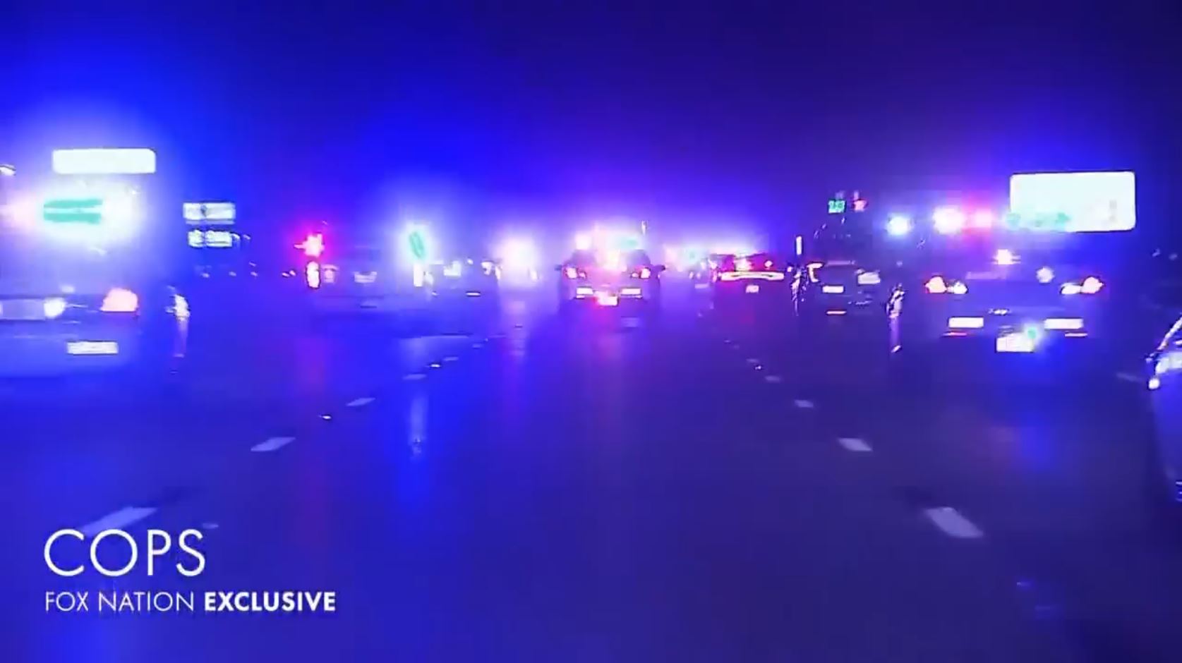
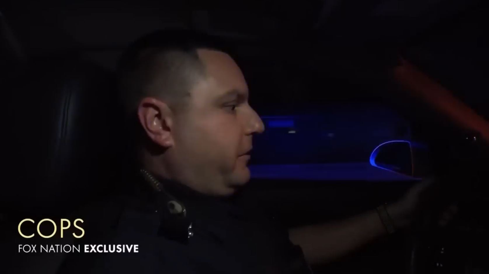
This shot features a fleet of cops chasing a car in the dead of night at like 5x speed. It’s pretty intense. It’s for the show “Cops” and has multiple subliminals.
The obvious one is the sirens. They flash red, white, and blue on the screen: Patriotic colors. The colors are extended through space in the glare and haze of the night. The cops themselves are symbols of America, well, mostly. They are the enforcers of local government, which isn’t precisely “America” but gets lumped into it via categories being close enough. This is helped out by cops being similar to military in many ways. Our military is a symbol of America. You get enough instances of Category Close Enough or Near Lit and it can push it into being the actual thing you aim at. Did you ever notice that people with the cop flag on their car also are likely to have an American flag on it too or some other Patriotic sentiments.
I’ve created false memories in people’s heads by using this “Close Enough” or “Near Lit” phenomenon. One doesn’t need much skill for a basic level effect. In some of my evening classes, I’d chose a word that I forbade myself to say. Then I made a list of 10 words that centered around it. I read these out loud to the group and then had them recall on paper what I listed. Usually, about 70% of them get a false memory implanted in them. They will swear they heard me say the forbidden word. They feel really certain and believe their memory is strong.
In the 10th shot, we are now in the cop car with a cop. Again, his presence begins to evoke America/Patriotism. And this connection is already primed and really helped out by the red, white, and blue of the sirens flashing upon his face along with the interior of the car. His face is the primary white element of the flag.
Shots #11 & 12
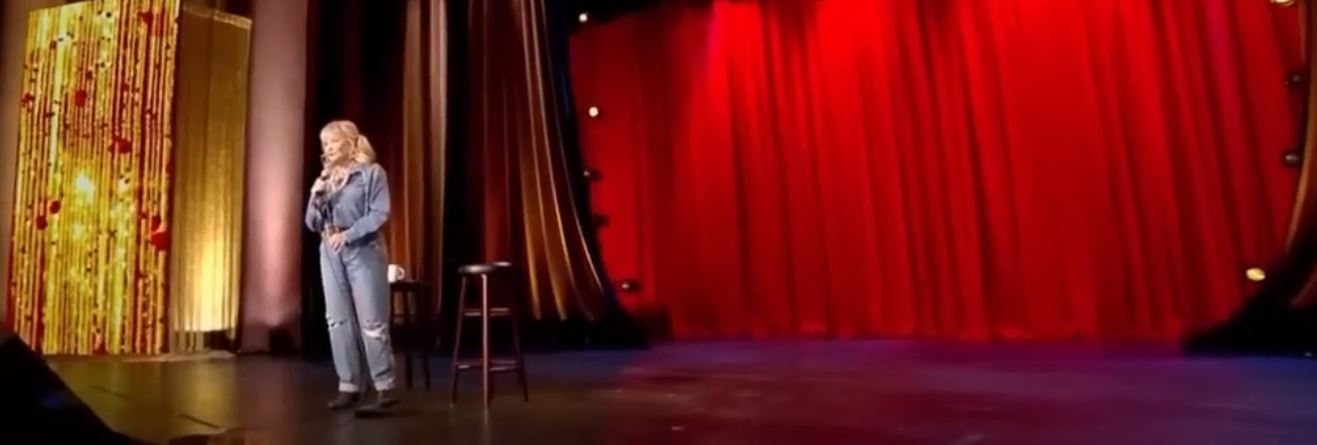
Let’s look at the stage. It’s a flag! Here’s a nice crop that highlights that. We’ve got this rectangle shape. The red curtain is obvious. You may have missed the blue stripe of lights stretching out from across the base of the curtain. Roseanne’s all denim suit helps contributes to the blue. The white and stripes and stars get a bit interesting. The yellow-red box to the left is positioned to be the field of stars on the flag. It’s not a perfect fit, but it wouldn’t be a subliminal if it was so obvious. Look at those specks of literal illumination on the starry field. Yellow can work as Color Close Enough for white, especially for lightbulbs. We end up not worrying too much about the yellow due to the giant white curtain just to the side of it. The subliminal still works well without it. The stripes are found in the many curtain folds and the yellow lines on the starry field.

Now look at her close up shot. We still get the red, white, and blue as the dominant and only color scheme, aside from some small noise on her white scarf.

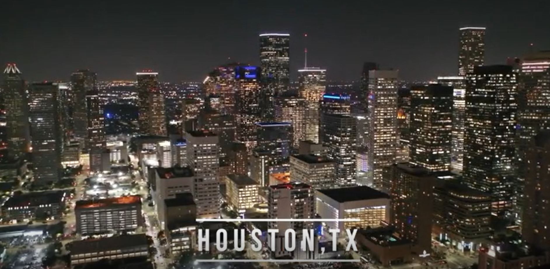
By the way, I watched the first 3 minutes of her show. It’s flags everywhere. The first image is an animated Fox Nation logo – very strongly a flag. The next two shots are of the nighttime lit city. Right in the center, we have an unmistakable red, white, and blue rectangle, purposefully lit to evoke “America.” An extra Patriotic subliminal is hidden here too. Would you have noticed the white outline of Texas if I didn’t circle it for you? In the second shot, the flag is a more subtle subliminal. The flag colors appear dispersed and scattered across the screen, as part of seemingly independent buildings. Our brains are still burning Patriotism from their logo entrance, so a gentle breath of color get the subliminal done. And within the first 3 minutes of her stand up, we also get the Patriotism + Force. Roseanne says, “Let me rally the troops.”
(These next 4 pictures are from her stand up show)
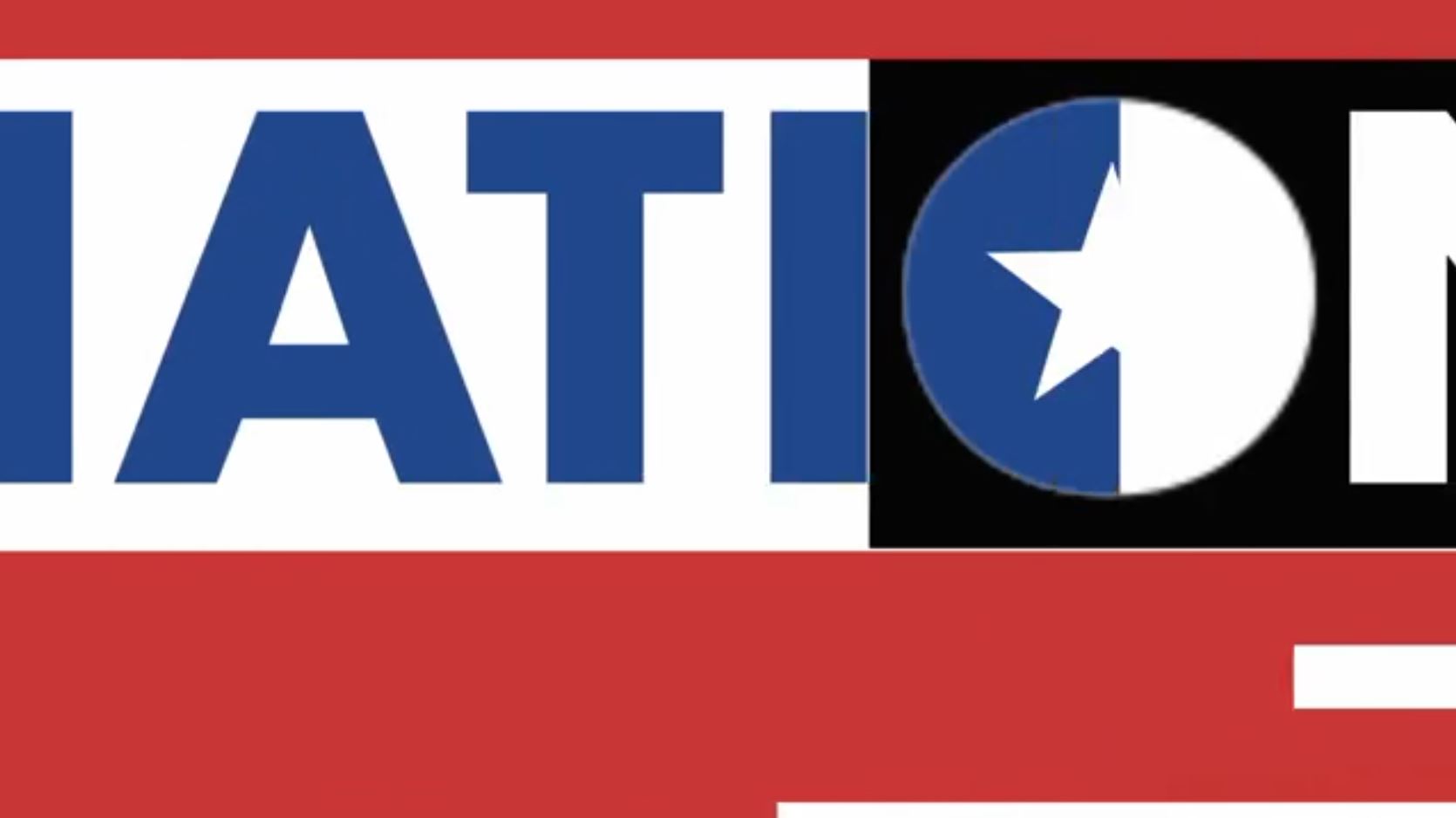

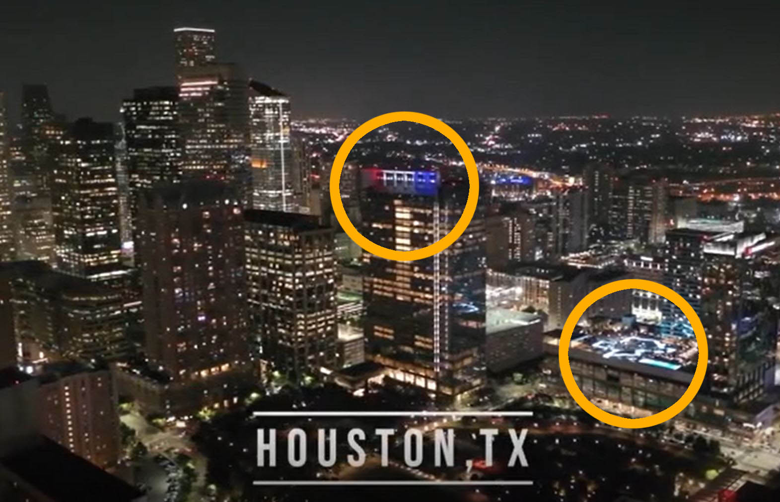
Roseanne’s personage herself lights up America. She was most recently in the news for being an ardent Donald Trump supporter, even receiving a personal call from him as President due to her defending him on Twitter. She made even bigger waves by tweeting a racist comment which immediately got her new hit sitcom canceled, literally within hours. Many of her defenders’ twitters were filled with right wing memes. Roseanne also ran for President once. She is now considerably linked to the political conversation in America. In fact, her stand up is about her cancellation and filled with jokes about the 2nd Amendment, and Open Carry, and derogatorily calling people Hillary (Clinton) donors. For the right wingers who is the core audience, this shouts “America!”
Shot #14

We get to the end logo and tagline. This is very strongly Patriotic with 3 hits. The first is the FOX Nation logo itself: red, white, blue, with stripes and stars. It’s so obvious I joke and say it’s not even subliminal, but it is because you forget to consciously render that after a bit even if you noticed at first. The second hit is the word “Nation” in the logo. That word is so very closely tied to America every time we use it that America fires as well. The third hit is a straightforward elicitation, “America is streaming.”
Patriotism #2: (FOX) Next Level Chef
These subliminals are excessive, in your face, and slickly sly. FOX must have used their Daytona 500 guy for this. We also covered both of these ads in the Force analysis section. Here, we’ll find a lot of Patriotism.
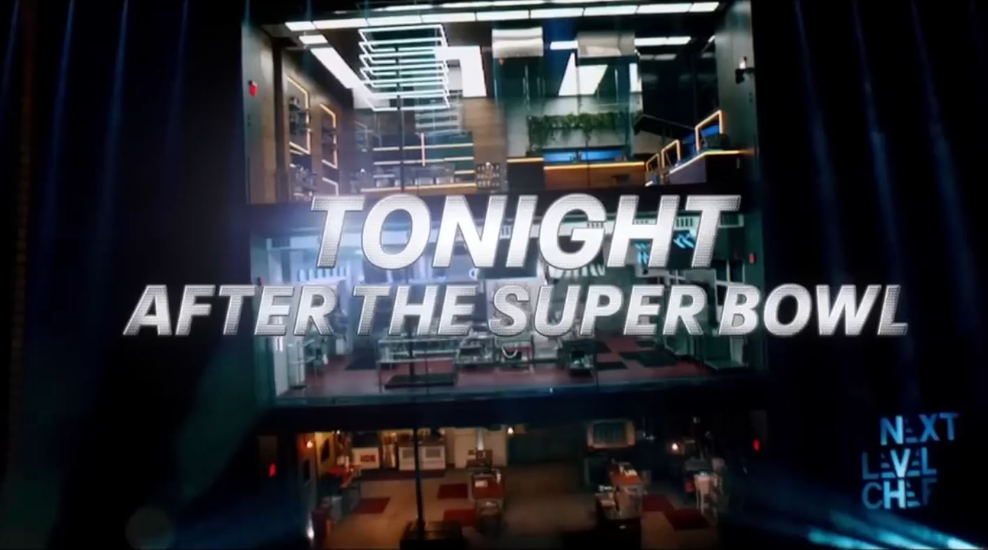
In the first second, a lot has already happened, and multiple things have flown at our face (Force). The editor has also started his first devious-genius subliminal, a giant 3 story flag that fills the screen. Didn’t the Daytona race ad also have a giant flag fill the screen within the first second? Didn’t the FOX Nation ad have a giant American eagle that filled the first second? They did. However, this flag is subtle. You are supposed to consciously miss it. Let’s take a closer look.
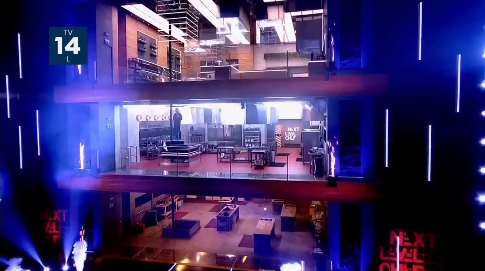
The image above, you were not meant to see. It’s a single frame, lasting 1/30th of a second. It’s a tidy subtle flag: red, white, blue, plus white stripes and stars. Frame #2 starts an explosion that will wipe out almost all his red. He even kills the red lit logo and makes it the color of the explosion, white. I imagine the director was faced with a problem. He has to pander to Force, but it gets in the way of his flag subliminals. What can be done?
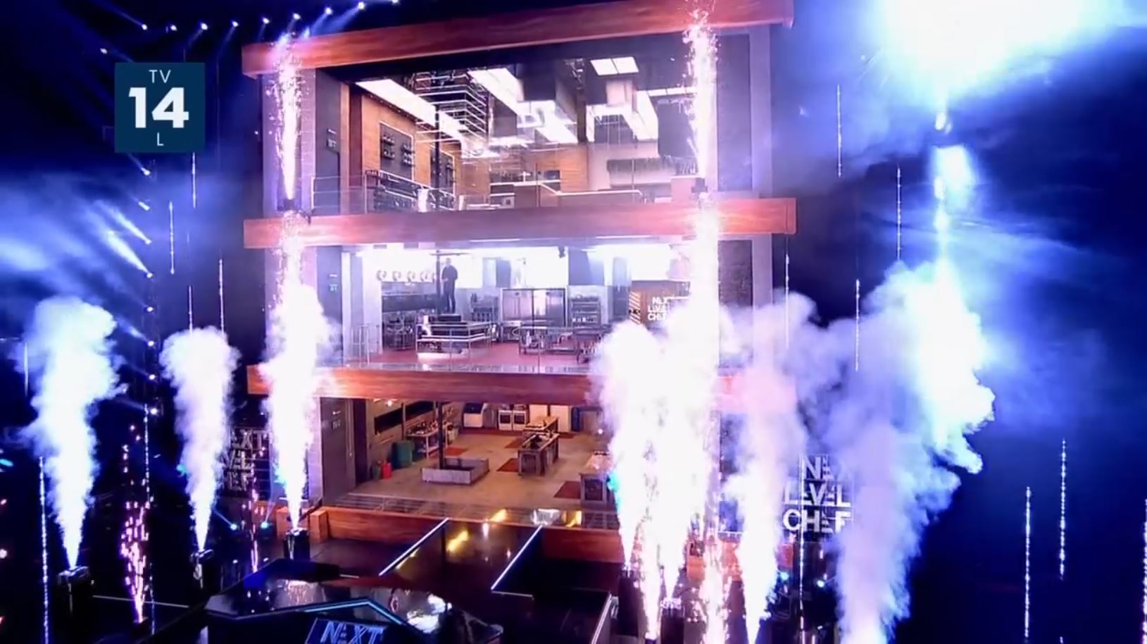
I see two principles at play. I call the first one Lingering Liminals. Colors like to linger in space mentally after its gone from the screen. Yes, we can set this up as efficiently as 1/30 of second. We have a really good swath of red throughout the most of the screen’s center column. The red logos on either side. The two lower floors being red (one painted, one saturated by red lights floor mats), the wood paneling of the building being lit with red tones. When the explosion hits, the dominant colors are tan-brown and white, being the wood and harsh lights. Unconsciously, we continue to render the red as a general impression of the image, at least for a few moments anyways.
The other principle that helps out is Color Close Enough. The brown wood is close enough to red that sometimes it can work as a stand-in even without that red flash-frame imprint. You’ll see wood working as red in the USFL ad below from the same network. Also, it should be noted that there is red throughout the image, just not dominant anymore: the sparklers, middle floor, and floor mats on bottom floor.
In old school subliminals, we thought you could just flash a logo or product in a moment split faster than the conscious could recognize and believed that would work. It’s not really like that. You can’t just pour water on the ground and expect things to grow. Some places are rocky or too sandy, or, most importantly, no seed is there to grow. Today it’s more about accessing deep patterns within and imprinting those feelings onto a brand. Flash subliminals work depending on how much prior work has been done and how well an individual is already imprinted. After that, you can begin to elicit or evoke that neurological pairing more and more efficiently. FOX has put an extreme effort into putting flag-themed colors throughout their programs, often accompanied by trance-inducing motion, and political commentary.
A questions arises: what happens to someone immersed in specific subliminals for multiple hours daily over several decades? Would it be like adding to hulking momentum? Does the physical brain structure become so robust and efficient that other ideas are rejected outright or at least hard to even hold? In the world of hypnosis (i.e., unconscious persuasion) these are easy things to talk about. You might be really impressed to discover what we can accomplish.
I want to tell you that the work they are doing in this ad is really quite good and really quite sophisticated. I’m impressed.
Shot #3
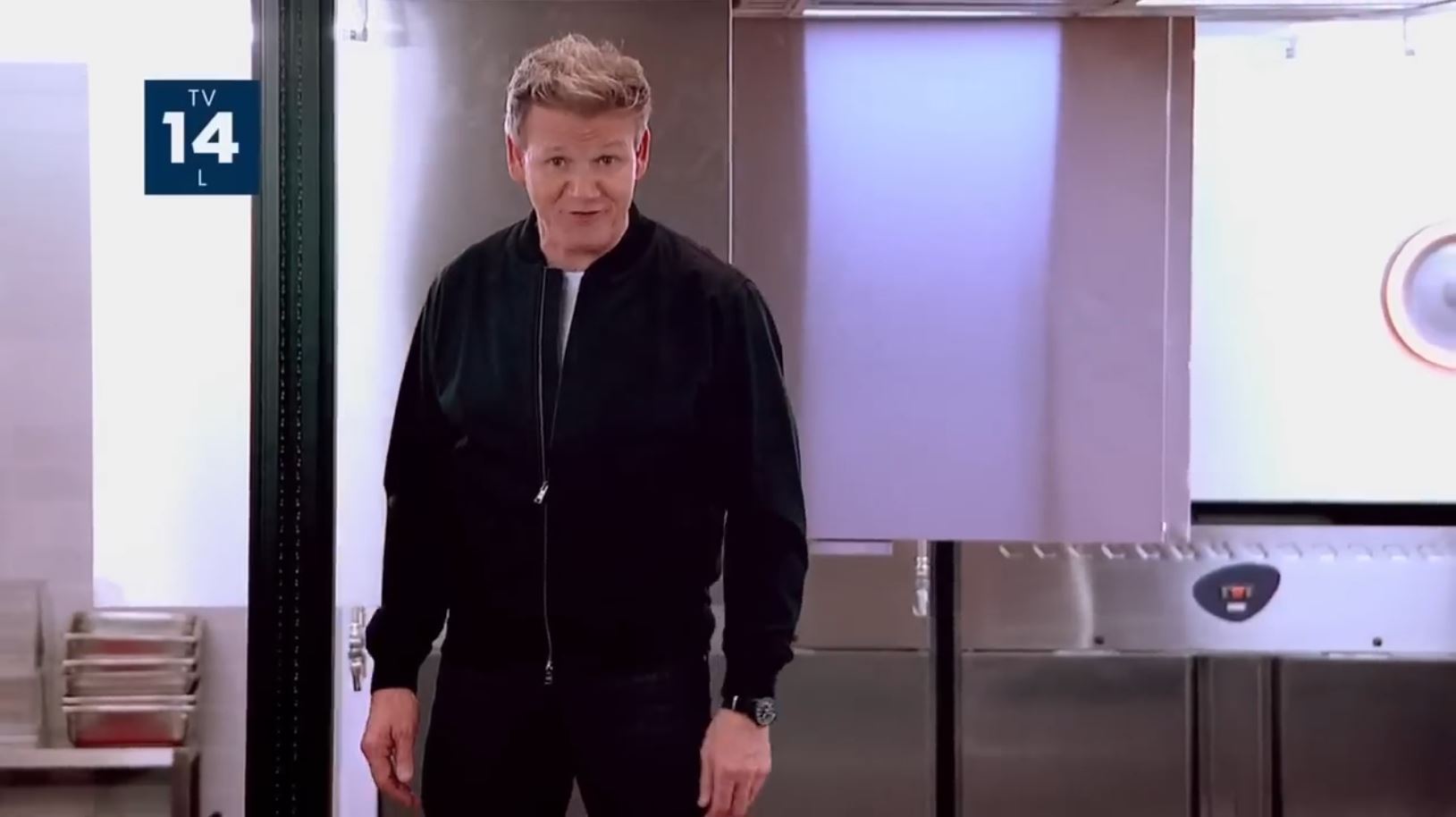
It’s another flag in Ramsey’s return. Stainless steel is wonderful for subliminal color work. It can reflect any color, and it also has a high affinity to be Color Close Enough for blue or white, depending. Ramsey stands in front of a big reflected swipe of blue. For the red, we get the floor reflected in the pans, Ramsey’s red hands which have collected some glow from the red floor, and the red button. The interesting bit is the circle’s shadow on the right. When have you ever seen a red shadow?
Shot #4
This is a single frame of red, just like in two shots ago we saw a single frame of red set up a subliminal effect. It’s also at the first frame of the shot here too. The coincidence is intriguing. I can’t figure out what it’s supposed to be doing, if anything at all.
You can find a single column of red spot light right by the left side of the screen. You may need to turn the brightness all the way up and enlarge the image for it to show.
You can find a single column of red spot light right by the left side of the screen. You may need to turn the brightness all the way up and enlarge the image for it to show.
Shot #5
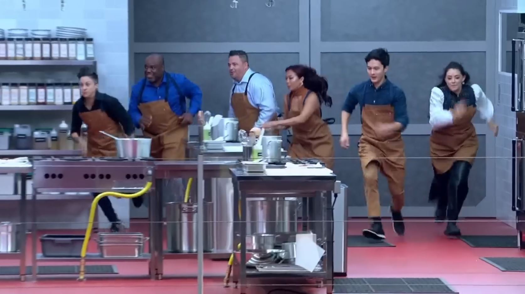
Contestants are racing at us and to the side with the zeal of Eastern morning to fill a basket. The Easter egg here is a flag. The red is the floor. The white shows up in the reflections off the steel and the seasoning labels. The blue is made in a cool way. It’s in the people’s clothes. Of the 6 people lined up in a row, 4 are wearing mostly blue. It doesn’t matter that the hues are different; it’s all blue. The other two also wear blue but less prominently. The wall is something like a big field of blue-grey.
Shot #8
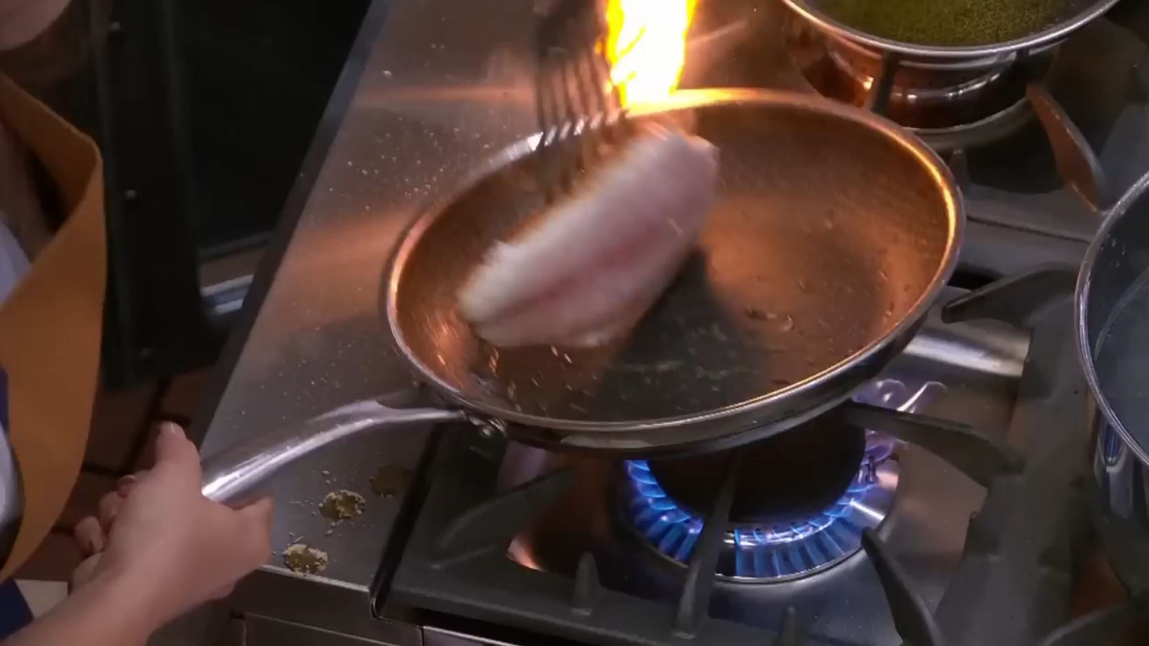
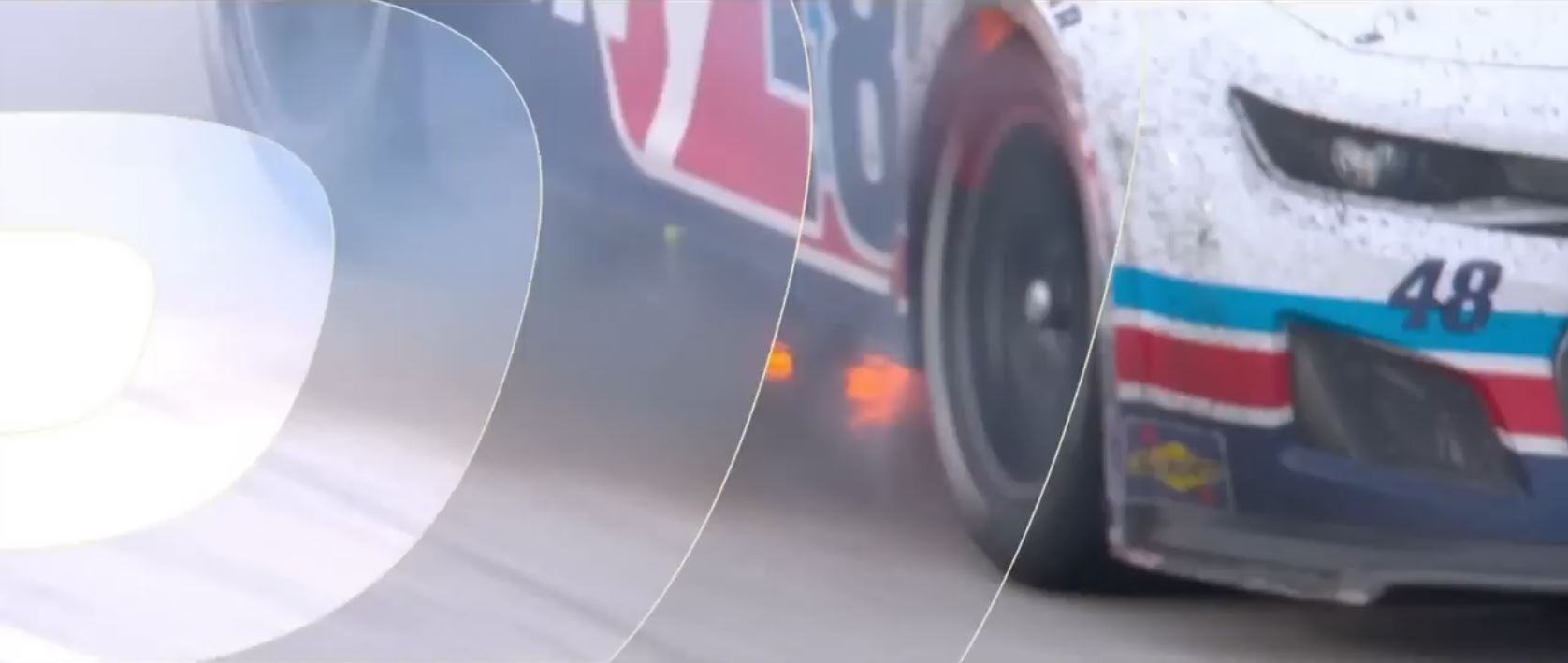
This subliminal hits like a flash in the pan, literally. We are brought into the scene as a pan is flaring up with fire, making a nice red field. The flame can be Color Close Enough and we associate fire with being red as mental category. Well, let me ask you, what crayon do you grab to draw fire? And I want you look at the casted glow that the fire makes in the pan and on the stove. That red saturation takes up a fair chunk of the screen.
The main blue is the gas stove. The steel can play a bit blue at parts, at times. The white is the reflection of the studio lights throughout the image.
Shots #9-11
These aren’t great as flags. Red, white, and blue are prominent and make the color palette in two of the shots.
Shot #12
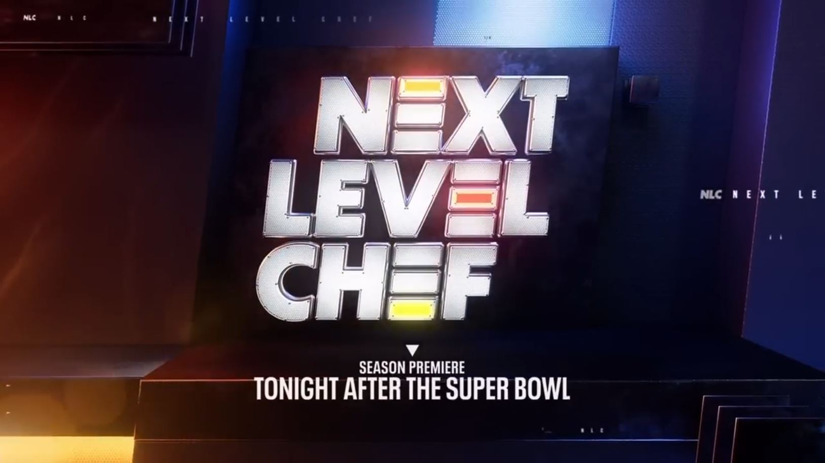
The end logo of course has a flag in it. This uses the same split saturation technique used in the Daytona race shots. One side is largely red via casted glow from a near color. The other side is largely blue from a swipe of blue light with casted glow of near color. The logo is white. We also have white stripes in the stylized “E”s of Next Level Chef. The repeated tiny show name in various places help with the white stripe feeling.
Patriotism #3: (FOX) USFL
Where you find FOX, look for flags. This US Football League has several variant commercials, all flag-themed, all hosted by FOX. The league makes the FOX-flag pair easy as their logo is literally an overt flag inside the USFL letters. Subtle flags are also hidden throughout the ads. You can see their effort at times to really be sure the flag colors get in there. This even goes so far as fixing up deficits between shots so the subliminal will hit. If this were by coincidence, I should not be able to predict what the next frames will hold. However, I find myself repeatedly predicting the next shot, and so can you.
The USFL as a flag is so obvious and explicit that it shouldn’t even count as a subliminal. It is a message being broadcast loud and clear, “We are the US football league. US (Patriotism) is in our core identity.” Yet there is a subliminal effect, just off to the side where you aren’t looking, where any good magician works his magic. The subliminal happens in the pairing of the FOX logo with flag in its obvious or subtle form. Here is the end shot of several variants of this commercial.
We’ll focus on the long version of this commercial. It has high-level sophisticated work. The tricks are nested, like the dreams in “Inception.” The first level is the story of the ad. A guy walks into a bar . . . but, because there’s no more football, it’s dim and dark. The commercial explodes into vibrant color and dynamic football action (and flags!) when they tell us USFL starts in 8 weeks. This follows the hypnotic principle of Pace & Lead. If you match one’s experience, they are more likely to follow you into a new experience.
The second level down, we get more cool subliminals. We’ve actually been seeing flags the whole time, but they were super disguised and craftily made. It might rise to the level of art form here. Amazingly, your unconscious actually keeps track and categorizes multiple tiers of hidden information without you knowing. In hypnotic work, we do this as an “every session” skill set so the client can’t get in their own way to become their best self.
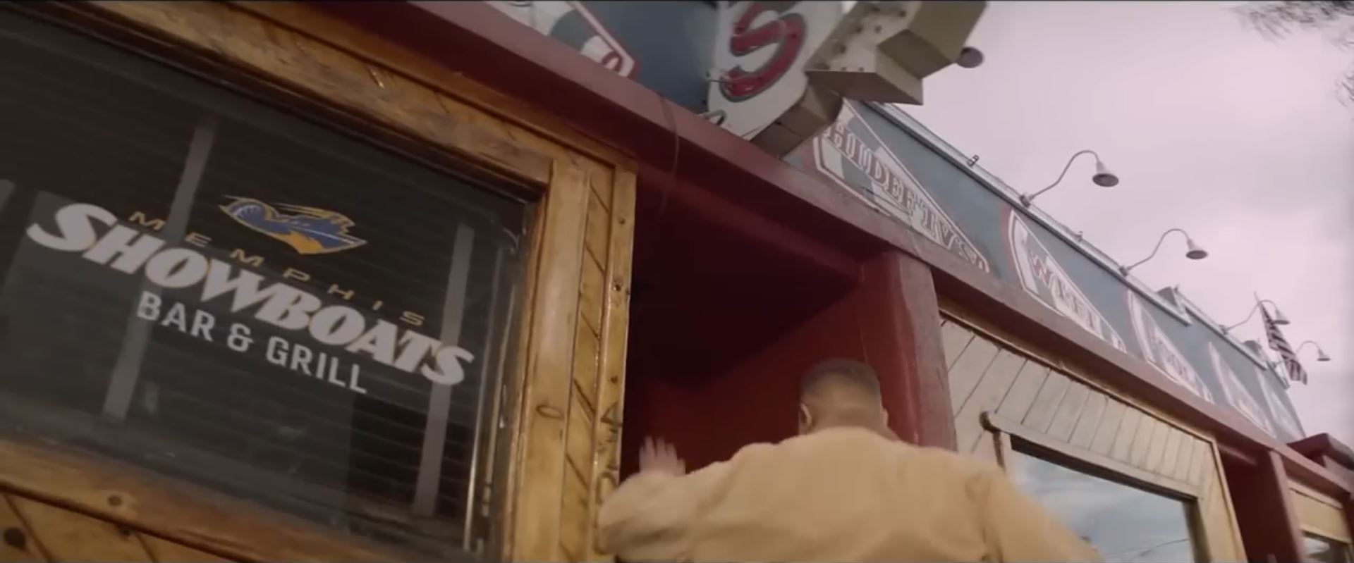
A master work happens over the first four shots. In shot #1, how many flags can you count? There’s many. We get an overt actual flag on right edge. Then the building banting signage creates six subtle flags: red, white, blue, with stripes and a flag-ish shaped. Then the top half of the screen is another subtle flag: white sky, blue stripe on wall by roof, red doorway and red stripe ceiling line across the screen. That’s eight flags total. So, now we have that general impression of a flag from the image as a whole and then also our many specific items inside the image that evoke a flag in themselves. Once we get into the dark inside, you’ll need an expert’s eye to spot the new ones.
We are guided inside the dark bar in shot #2 as the narrator says, “After today, no more football.” About 98% of the color has been sucked out. That’s really important. It’s amazing how we’re about to miss two significant signals to pay attention that our unconscious catches.
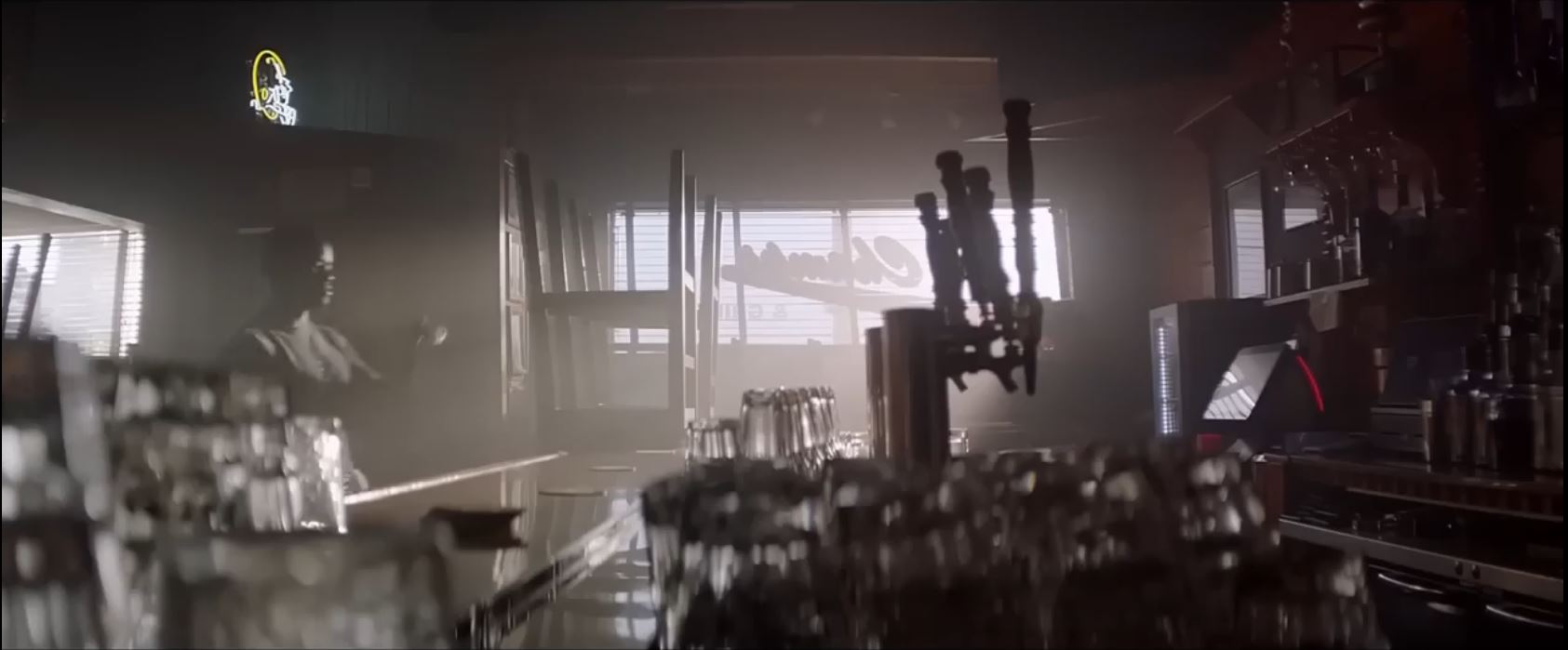
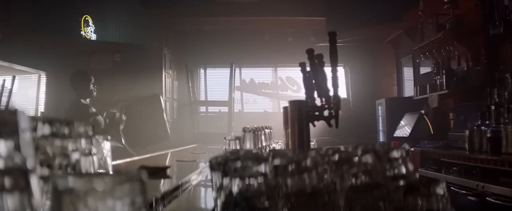
The first signal we miss. In the first frames, we get our flag colors which are over by the cashier’s tablet (red and white) and mini fridge (bluish white). White stripes are on the tablet screen from the reflected blinds. It’s not a great hit in itself, but you were just primed with eight flags one second ago. Now, you are signaled to this spot by that strip of red which slowly changes color over a few seconds. You don’t notice this consciously because you are given a fool’s item to follow, the chair. It’s like the three cup & ball scam. The magic happens off to the side where you’re not looking. With your conscious eye on the guy moving chairs you miss the signals your unconscious is getting to “Pay Attention!”
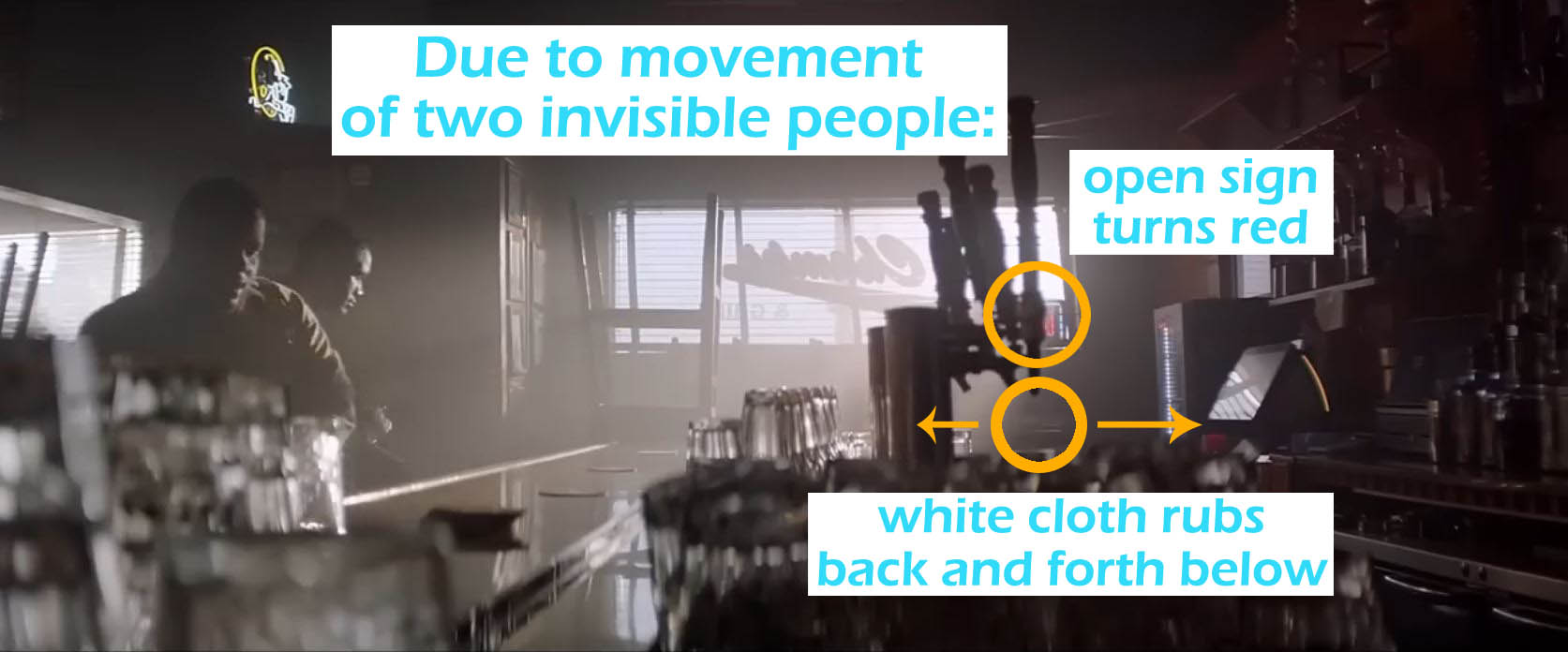
The second signal uses two invisible people. The setup to understand this is that red here is too weak to impress a flag as a general image. It was ok until the red stripe turned yellow, but now he has to fix it. How? He has someone stand concealed in shadows until they move to reveal the red “Open” sign. A signal is even sent to the unconscious to make sure it catches the change. Did you miss the white bar cloth swiping back forth 5x under the Open sign? It’s got this great rhythm and jitter-jerk that is beautiful at drawing the unconscious. You never a see a human silhouette on either of these people. That’s important because the flag subliminal would be lost to it. Our unconscious definitely prioritizes catching lurking humans in the shadows.
In shot #4, we get a really awesome subliminal flag. This shot was the editor’s playground. He used the blur tool, bent space to emphasize the flag shape, and added shadows to form the subliminal. Let’s look at the flag. The flag pole is made from the vertical line of the window divider. The cloth of the flag hands down in a narrow triangle. For the blue field with stars, this is rendered as the shadowed field with spots of sunlight shining through the window slats. The red and white stripes area gets more interesting. It has an excessive kind of sloppy amount of blur, and that is an art where mind tricks are hidden:
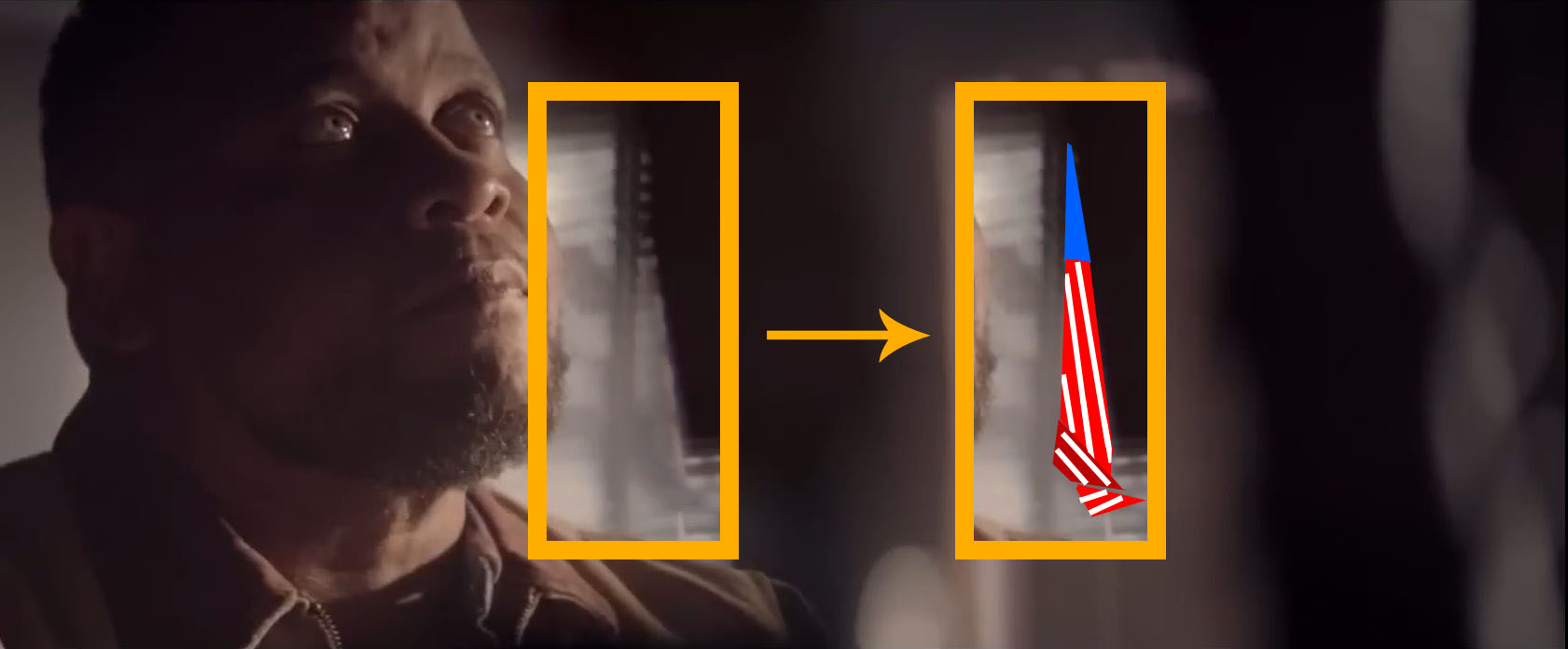
(1) Even though the stripes are blurred out, we add them ourselves by a Principle of Categories. Basically, if we put something in a categorical basket, we begin to impart all other elements in the category onto the thing we put in. For advertising, this is very useful if you want to add a quality to something. In hypnotherapy, I’m often fixing problems that arise from this principle. Children of narcissistic parents suffer much, even as adults. There is so much that goes along with the concept of “Mom” that stands in stark contrast to how mom actually behaves. The collision of real life against the wrong category creates suffering. When they see/accept their parent for who they actually are, a lot of the suffering just disappears.
Returning to the ad, our category of flag entails stripes, but those are missing there in the flag. So our mind just plops in missing stripes from its category to fix it up. It doesn’t really tell our conscious it did that. Now, here’s a cool thing. We get a double dose of the Principle of Categories creating stripes because the flag is created of window blinds. Stripes are the very essence of window blinds, and so it is mentally rendered although visually missing. It’s a neat double trick.
(2) He creates an illusion of cloth in light breeze at the bottom of the flag. Is this just coincidental? Notice how some of the surrounding slats have very low blur but his flag has thick blurs which flows like brush strokes. It looks like cloth flowing in the wind. To enhance the cloth flow, he blurs over that slanted line of light, further revealing this to be an edited image. That line is supposed to be from the string holes in the blinds. Is there anything blocking it in real life? And why is the line so slanted? These all go towards bending reality in a way that makes a better flag.
He plays more, it seems, by adding in objects that weren’t there. Looking at the dark shadow jutting-forth. It essentially makes the long line the flag’s triangle. It also keeps the stars as spots instead of long lines. I couldn’t find it in the prior shots of the window. So what is it other than really helpful for this subliminal flag?
For the rest of the commercial, standard flag subliminals are flashed at us. I’ll just put up some pics and you can spot for red, white, and blue in each shot.
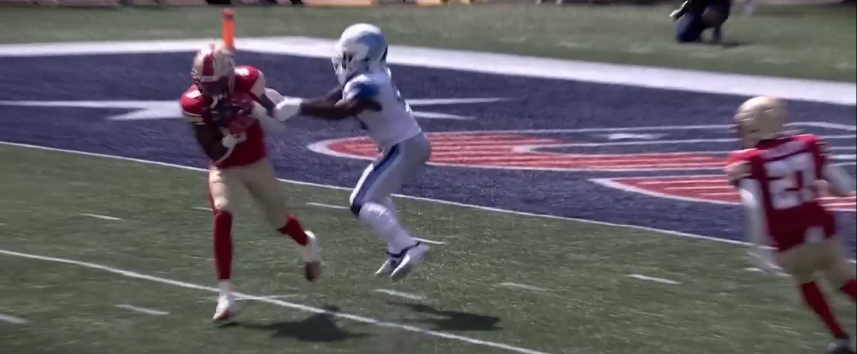
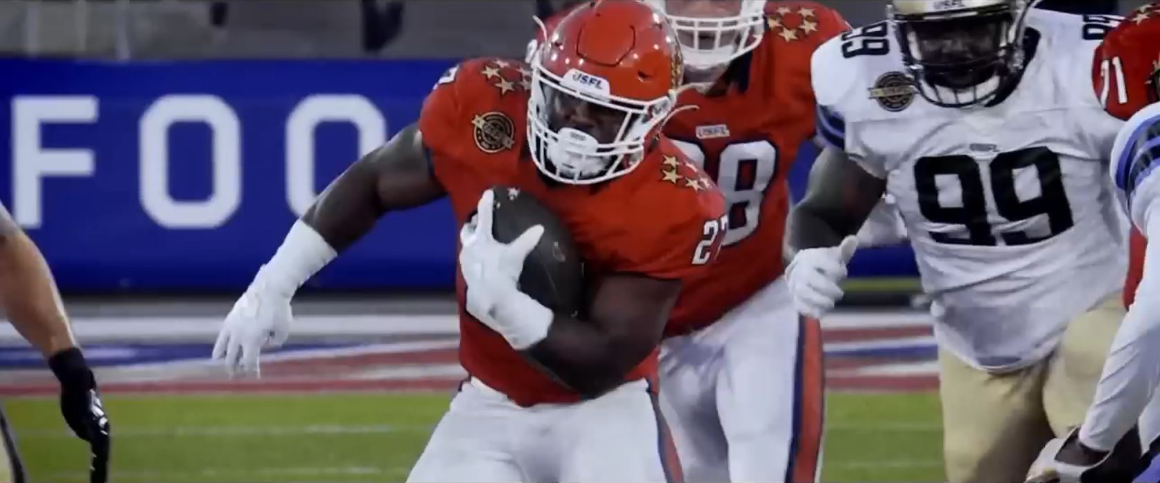
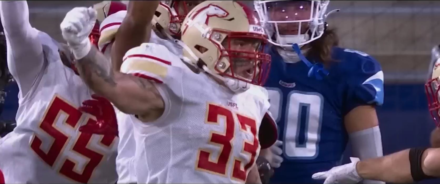
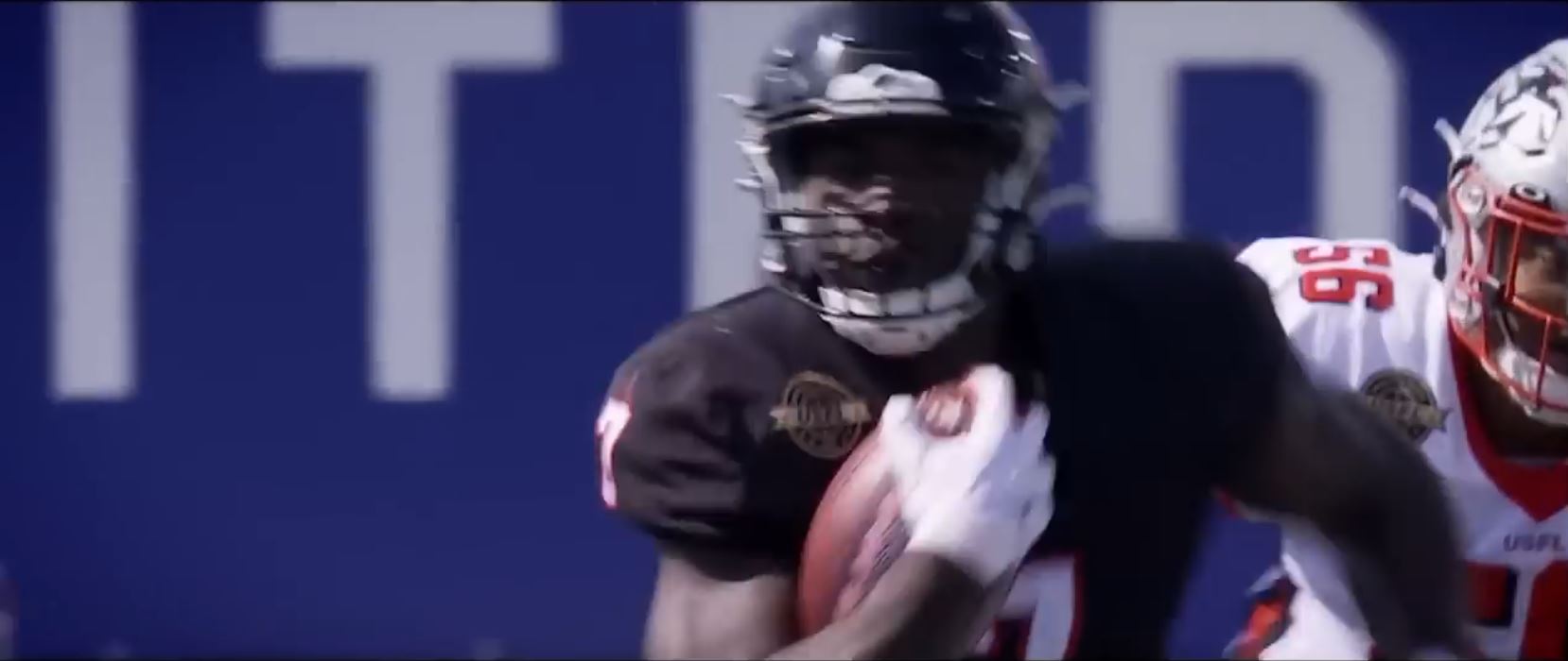
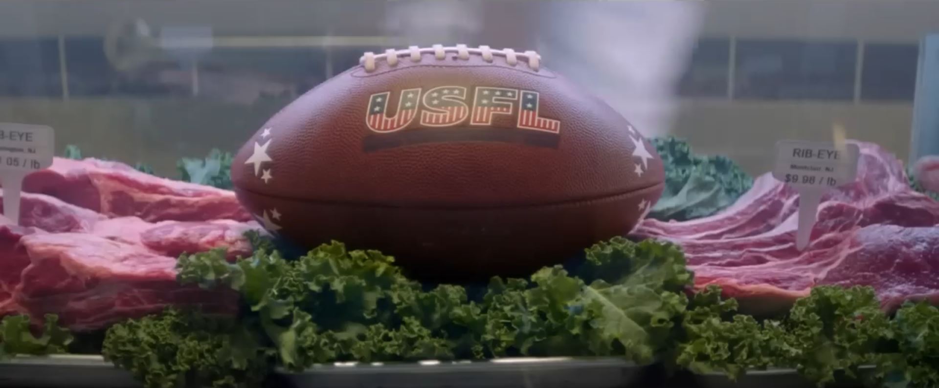

One subliminal does stand out for us to talk about. This is one where I guessed the next frame because I saw the director had set up a flag subliminal, but it was so deficit in a color that it wouldn’t evoke a flag. The director is far too versed in subliminals to make that mistake, so I knew he’d make it up in the next few frames while it was still active in our minds. And he did! We get a strong rapid fire double shot.
We first get the tip-off shot, then the deficit shot, then the correction. Here’s the tip-off: a shot composed like artwork, especially with symmetry. When a commercial guy goes through that much work, look closer. In the pic below, I’ve numbered corresponding elements. Note that they don’t have to be precisely the same in color or location. Close enough is close enough.
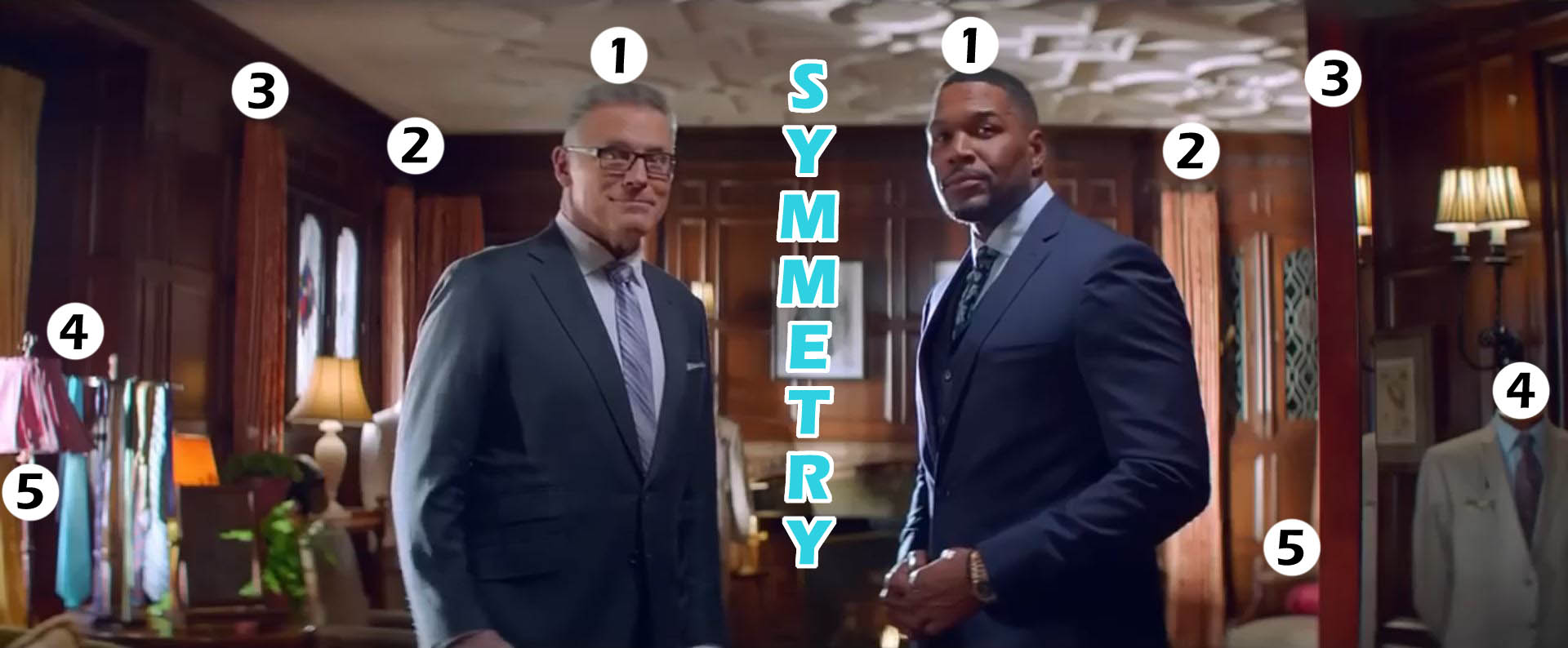
The focal point is the white portrait center screen. (1) The two men in symmetrical pose wearing pretty much the same suit and colors. (2) The red hanging curtains. (3) The red vertical stripe down the screen: a curtain and a wood pillar, perhaps. (4) A splash of sky blue: a suit’s tie and a collared shirt. (5) A splash of red: the red lampshade and perhaps the cushion of chair sticking out by the red pillar. We can argue for even more symmetries.
We’ve got the tip-off. What do we find here? Flags. It’s red, white, and blue. A nice note is that the wood is Color Close Enough for red, especially that pillar. We are also primed just moments ago to render red more readily. They showed us two striking shots of raw meat with a brown football on top of it. One of those imaged jumped at our face in an extreme close up. This sort of action penetrates our unconscious. There’s tip-off after tip-off.
On to the deficit shot.
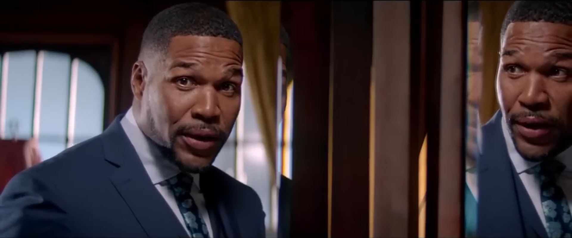
It starts with a hypnotic statement, “You better recognize the real” while the music that was playing goes silent. It’s better for the hypnosis to sink in. In my hypnosis course, we throw a ball around and generate hypnotic sentences exactly like this on the fly. Back in the ad, we’ve got a major symmetry with the mirror. Even the partial reflection on the beveled strip (with the blue glow) has a corresponding partial reflection on the left. You’ll see a sliver of eye brow and cheekbone touching the yellow curtain.
You’ve got to think like a director where each shot is planned and purposeful. Is he perhaps that unprofessionally sloppy to leave fractured images moving about on screen or has he risen to the grandest event in his field of advertising? The Super Bowl. Why did he choose a mirror shot in the first place? Certainly not for convenience. To me, the symmetry here links this and the prior shot in our mind. It allows a carry-over of feeling and meaning.
The problem with the shot and subliminal is that it lacks red. The brown here isn’t Color Close Enough anymore. It’s too dark throughout. Subtracting more, the prime of the red meat has faded through time. The other flag colors are here quite nicely. Because the director shows signs he’s definitely at work here, in both audio and visual, and because he has an exuberance for flags, you can bet money the next shot is going to be RED, and likely not gently either.
The solution shot.
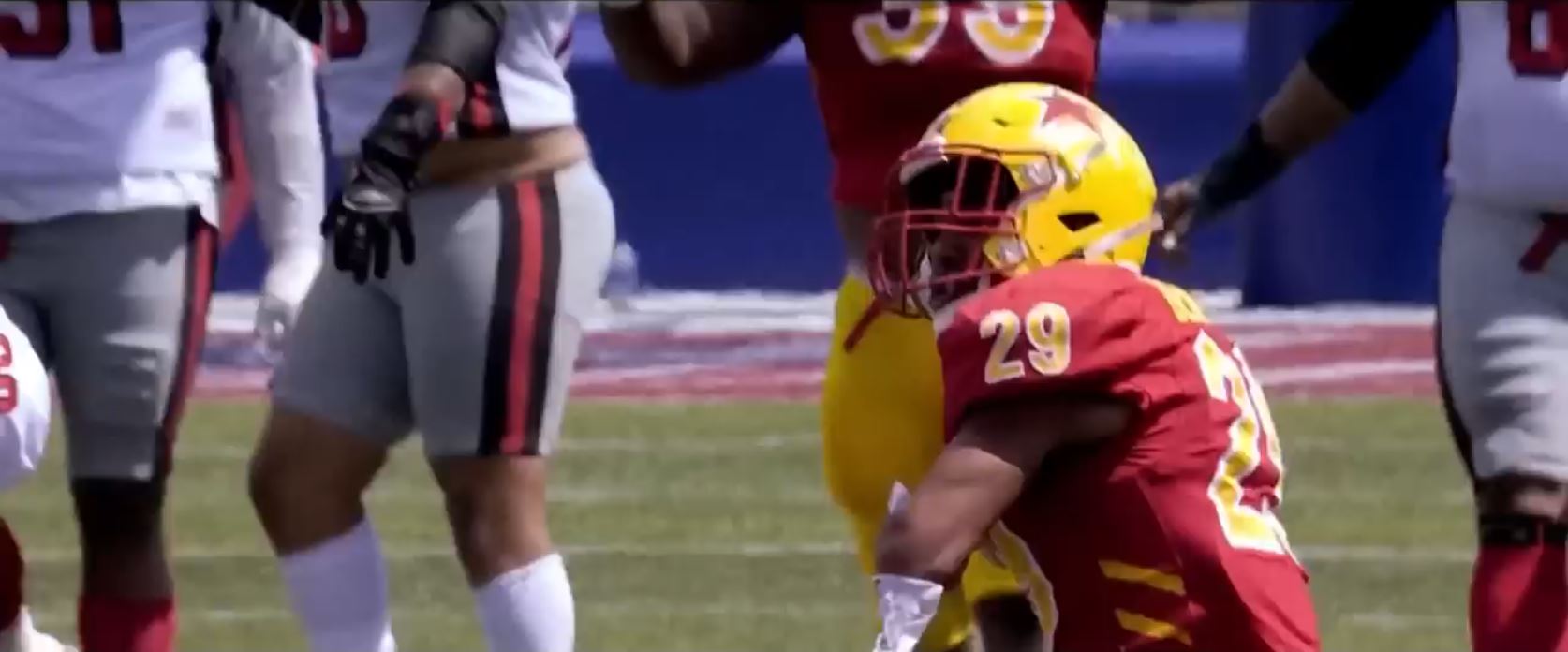
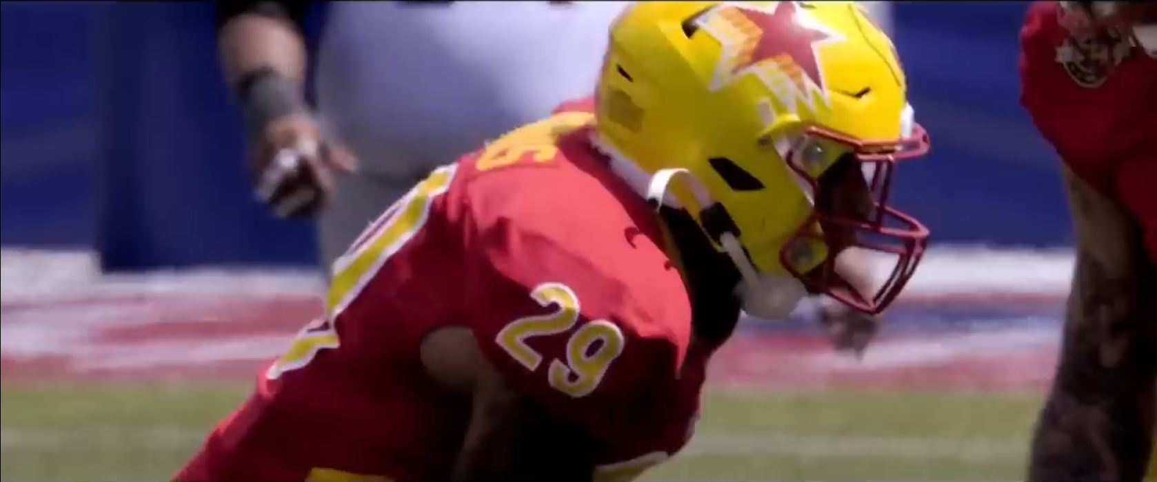
Red fills more than half the screen, and the rest of the image is a large subtle flag. This happens in two beats as the camera races red at our face, zooming against a speeding drum roll into a clash of cymbal that pierces the silence of hypnotic statement. The audio and visual tricks in this shot really help oomph the red. We also have a prominent star to help regenerate the flag.
The final shot starts heavily emphasizing the red and white stripes. It ends with a flag paired with the FOX logo. The smaller pic below is the first frame and is full screen. It zooms out to the lingering imprint below it.

Patriotism #4: (FOX) Daytona 500 Race
This commercial is flags! The American flag (Patriotism) is everywhere. It’s a mutli-layered, multi-imprint, rapid fire chaotic blizzard of excessive flags and Force. We reviewed a Fox Daytona Race ad in our Force section for this Super Bowl. This is the same event, largely the same footage, but a variant of that ad. Here, we’ll just review Patriotic subliminals. The flags unfurl at our face so fast and in such a quick a succession that we need to take this shot by shot.
Shot #1:
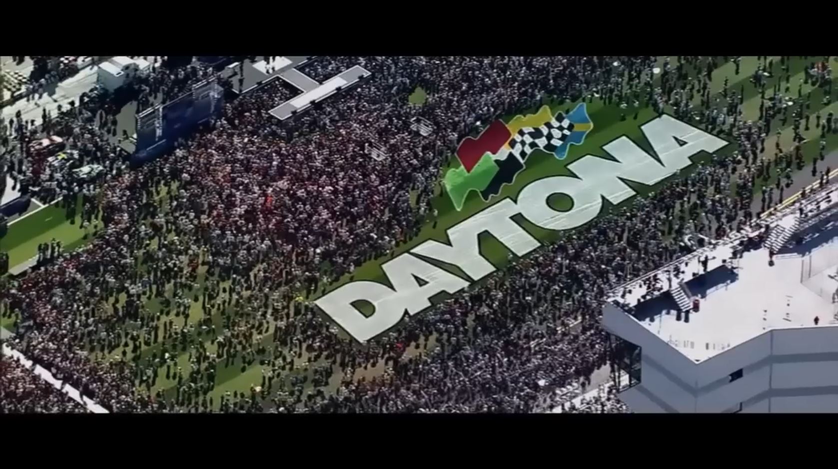
This is an establishing shot, but it also sets up an exceedingly clever trick. On the surface of things, we are shown one of the race logos written giantly on the race track’s field. This lasts just over half a second, and that’s all that’s needed for the editor to expertly set up our expectations to be exploited later. I mean it’s only natural to limit our conscious world to what is seen. Those black bars above and below are obvious here, but we absolutely disregard them as not even existing during the live commercial. The editor uses them cleverly in shot #3.
Shot #2:
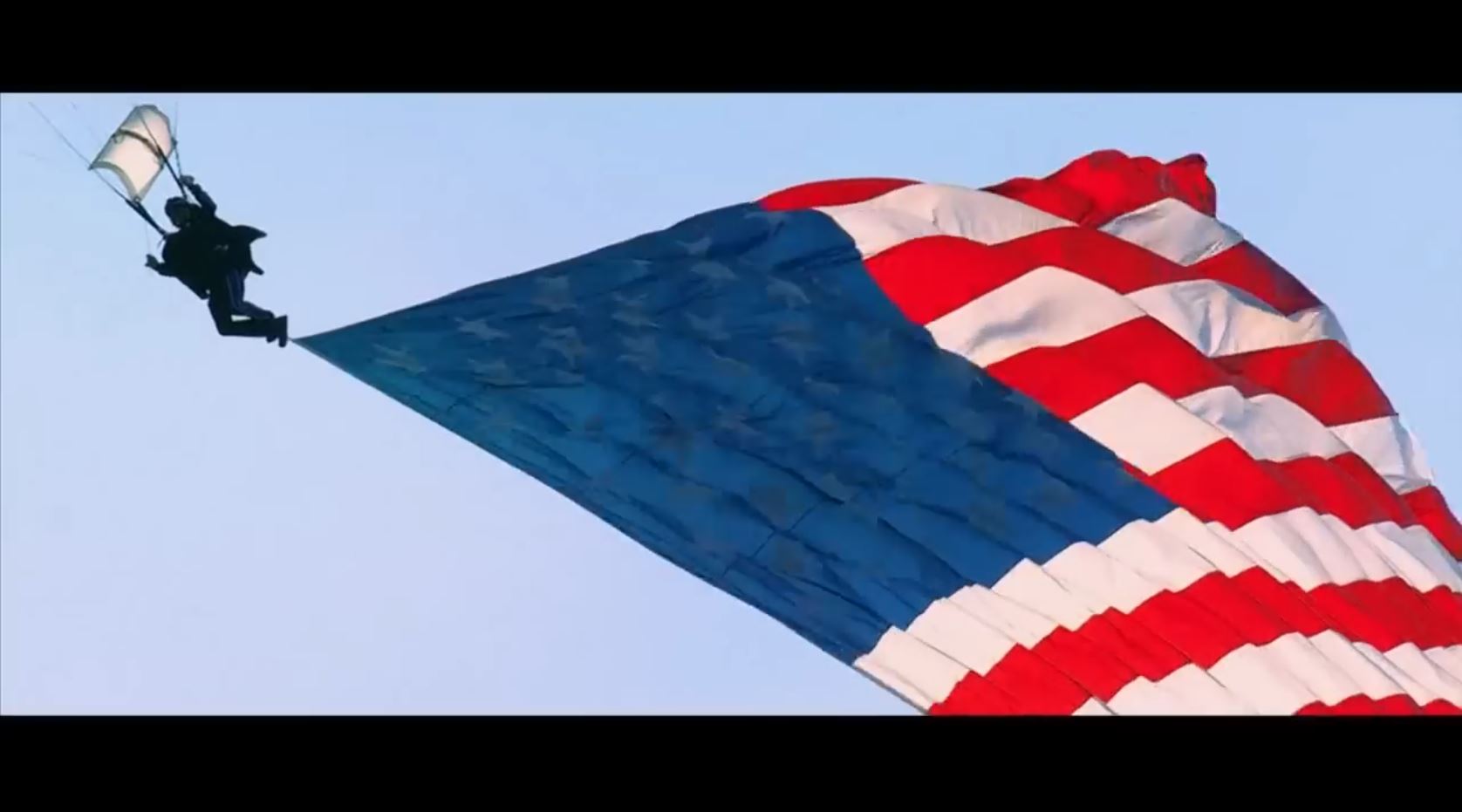
The flags start here. We are presented with a giant US flag that fills the screen. It waves majestically from a parachuting man. As soon as we start focusing on it and taking it in, the editor pulses some flashes. This enhances the flag imprint, making it more “sticky” in our mind. It also sets up intensity of the jets in the next shot. This shot is about half a second.
Shot #3
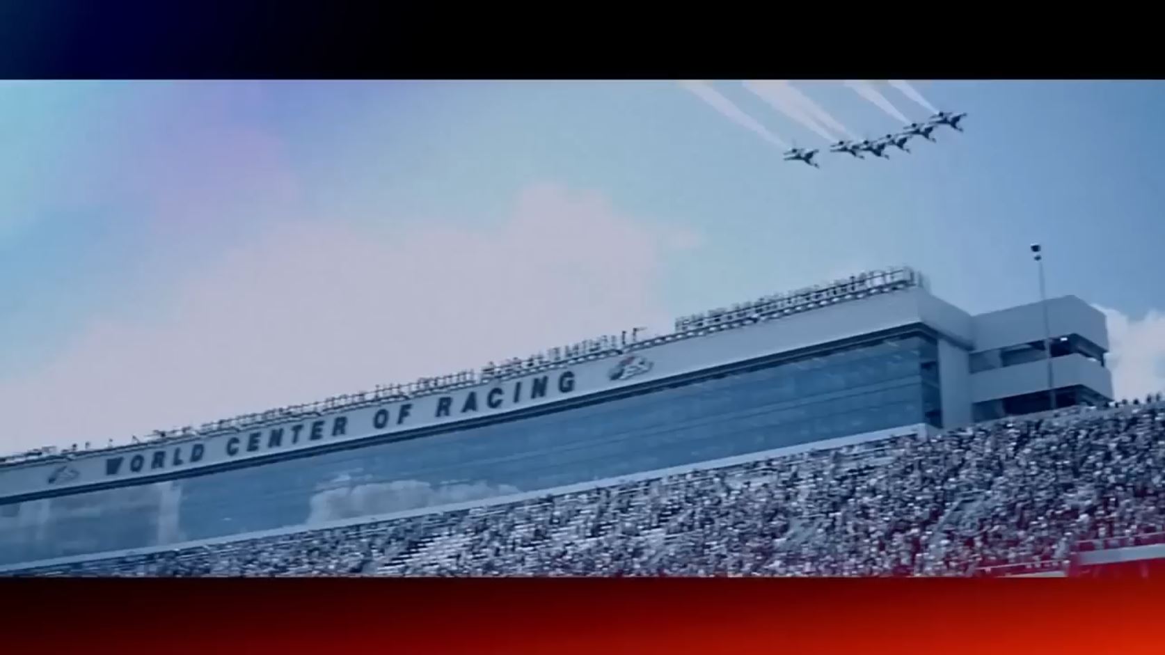
Jets fly over the stadium, and we are hit with 3 Patriotic imprints in less than half a second (13 frames). The first thing is fairly straightforward. The jets are American military F16 jets, the Thunderbirds. You can tell by the black bird painted on the belly of the craft, and they fly this event every year. What’s important is the jets’ symbolism. It’s our military. It is America flying. Patriotism.
Now we get into his master-level designed imprints. There’s two, and they are the second and third imprint of Patriotism in this shot alone. We think the video is constrained to the rectangle where obvious things are happening. We limit our consciousness to that false box. We end up not even seeing the black spaces around the screen. In that empty spaces of our unawareness, FOX inserts subliminals. In the space you have been trained to ignore, a flag is inserted. Here, they tinge the bottom right and upper left with red and blue, respectively. The main image is tinged blue with some white. We even have white stripes and stars. The stripes are the bleachers, jet trails, and building borders. The stars are the many white hats which spangle the screen and seem to somehow magically resist most of the blue overtones splashed everywhere.
He makes a second flag as well. Look at the video shot. That is not the natural coloring. He sucked most of the color out, except blue. So I started looking around. The cloud above the stadium is a very soft cotton candy pink, red tones. So are the jet trails, faintly red stripes. We’ve already talked about the white stripes and stars. Isn’t that incredible. It’s really sophisticated work. Can you tell I’m excited by it?
Shot #4 & #5
These shots focus on building Force with racing cars. Not much else to say about it.
Shot #6
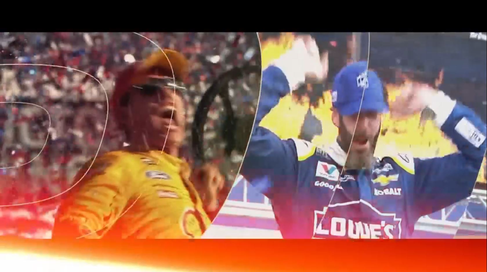
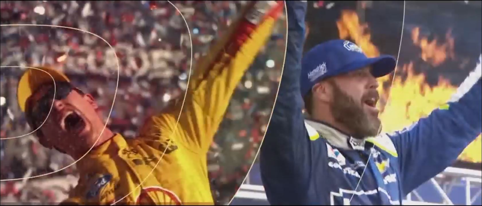
Back to the flag show of Patriotism mixed with Force. This is a split screen shot so we can get a double dose of flags. FOX tends to be heavy handed with their subliminals from what you’ll see in these ads. On the right side of the screen, the flag is in the foreground. On the left, it is in the background. They are both subtle to slip by your conscious resistance to them.
On the right side, the blue is easy. It’s his uniform. It’s speckled with white lettering and we even have white stripes in the railing behind him. Now, the red is interesting. There wasn’t enough of it for a proper imprint. Before video editing, there’s just a bit of red at the fire tips, but most of it is yellow. This is fine as it fits the Daytona logo colors (note the guy on the left). What the editor does is he uses that subliminal space below the main video to get his red in. So it’s a beam of fire with a red glow that extends through much of the unused space. If creating and using that space to make a flag in the jet shot we just saw was clever, he goes above and beyond in this. He is now having colors leap into the main video as if that after effects fire beam was actually there at the time in real life. It casts its colors onto his clothes. You can see a lot of his white lettering surrounded in red and red tint takes up part of the bottom screen. This guy is brilliant.
On the left, the flag is more subtle, as background work tends to be. The flag is made of two elements. The first is the red-white-blue confetti raining down behind him. That’s enough in itself. Honestly, I would be a little disappointed in how little blue comes through in the shot. It’s not enough to establish blue in the subliminal. Random luck of raining confetti. So, as a very clever editor, he has to fix this. Here’s a principle: you can pull in colors from a different part of the screen to fix the same color lacking elsewhere. The mind does a general imprint of the colors and doesn’t necessarily divide the screen in half, at least at one level of cognition. So this second subtle flag is made from both sides, from the whole screen. Just consider the dominating blue of the uniform to be part of the flag on the right. Problem solved.
I need to address this. There are almost certainly letters shifting about in the background on the left. Maybe this is just natural and they were there on the day. However, this editor is exceedingly clever, so I’ll leave this as a fun thing you guys might analyze on your own. Again, maybe it’s nothing. At the very least the text gives us like 3 white stripes for the flag.
Shot #7
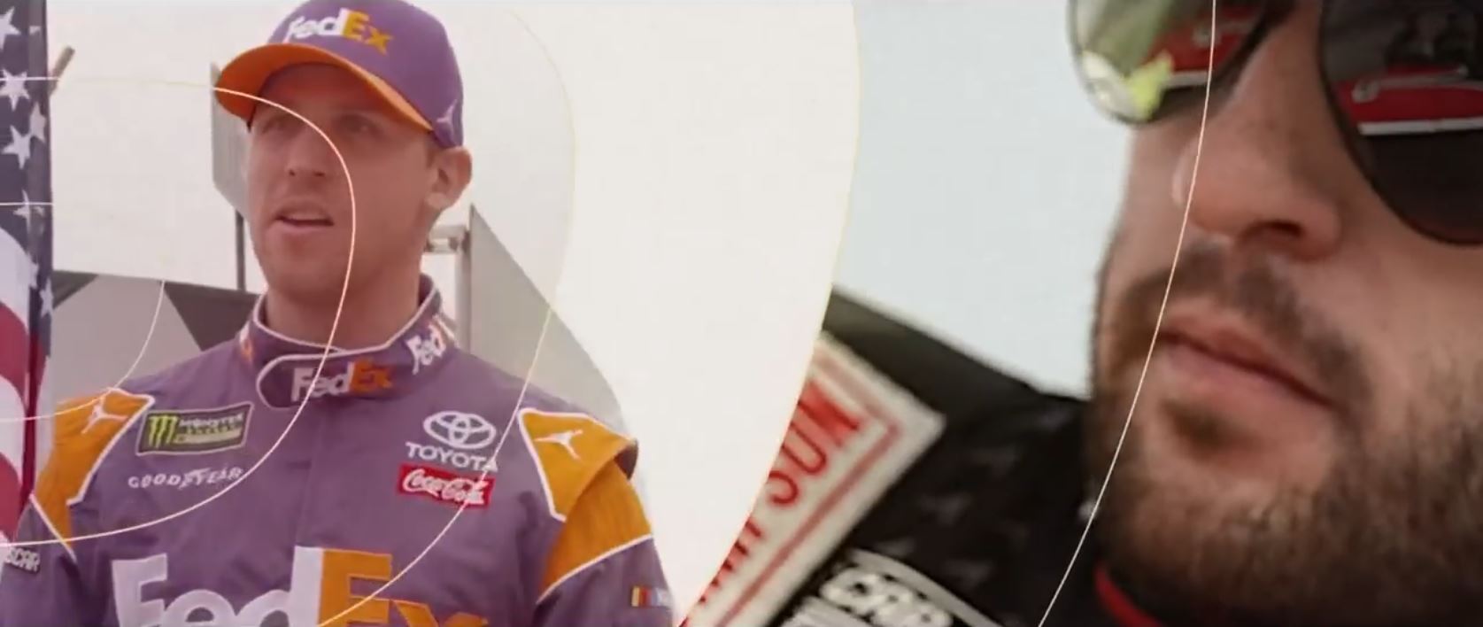
Two more flags appear in this scene, and the narrator has just finished saying, “Bring in some star power.” Saying “stars” can evoke the flag, especially when the editor has set you up to be overly ripe with previous flag priming. So that’s 3 Patriotic imprints in half a second.
Where are the flags in this shot? One is an actual American flag. It appears after a few moments on the left of the screen.
The other flag is subtle. I want you to remember the last split screen shot in this commercial, the “man on fire” shot. They had a (subtle) flag on one side, and then they used both sides to effect another flag upon us. The white, and blue, and stars and stripes are obvious. However, the red element is really interesting. On, the right side, it looks like they added the red letters in his glasses. Notice the two people in them? I can’t figure how they and the giant letter fit together if that was a real life scene. All the more because the red for the subtle flag doesn’t work without the red from the glasses. The flag wouldn’t be evoked in us. On the left side, the interesting red bit is the Coca-Cola patch. It is several times brighter than any other color on that side, and so our brain fixates on it and magnifies it. It’s the same like what happened with a zit back in high school. We look in the mirror and get drawn to it and magnify it, and it appears much bigger and redder than it really is, much to our horror.
This comes from out mental representation of it. It is essential if you want to understand how minds work. If you ask people with phobias of animals or insects, to get a mental picture of it, most always they are imagining the picture right up in their face and the creature is bigger than it should be. It’s the same thing with people with social anxiety or those who freak out in relationships. If you check, their mental representation of it tends to be inflamed and on its way to being volcanic. So, from someone who fixes these issues by changing one’s mental representation of it, trust me when I tell you that something interesting is happening there.
The flag juxtaposed also helps fill in the red without showing much of it. Again, this has to do with our mental representation of that flag being significantly red. Handy trick!
Shot #8
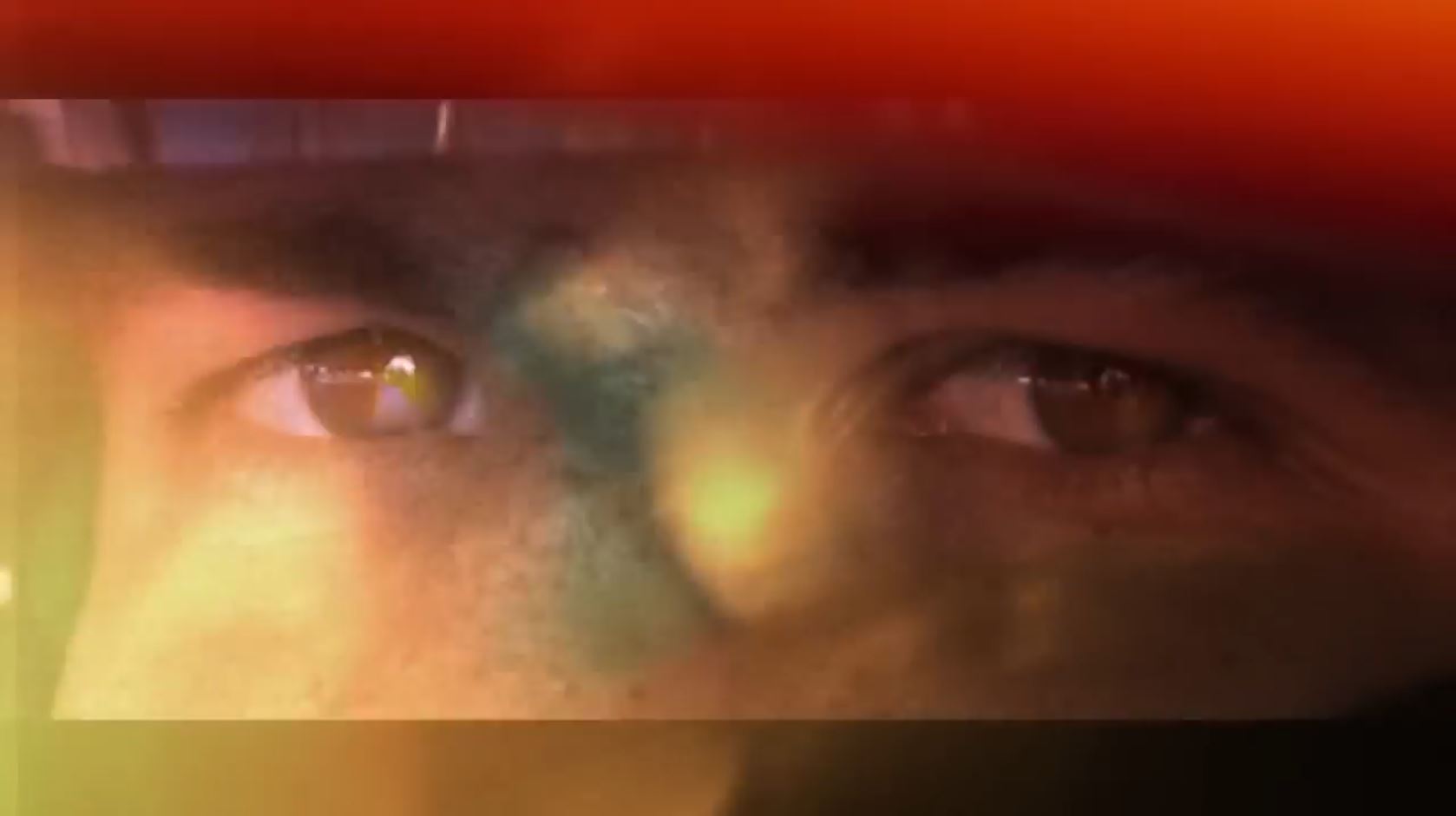
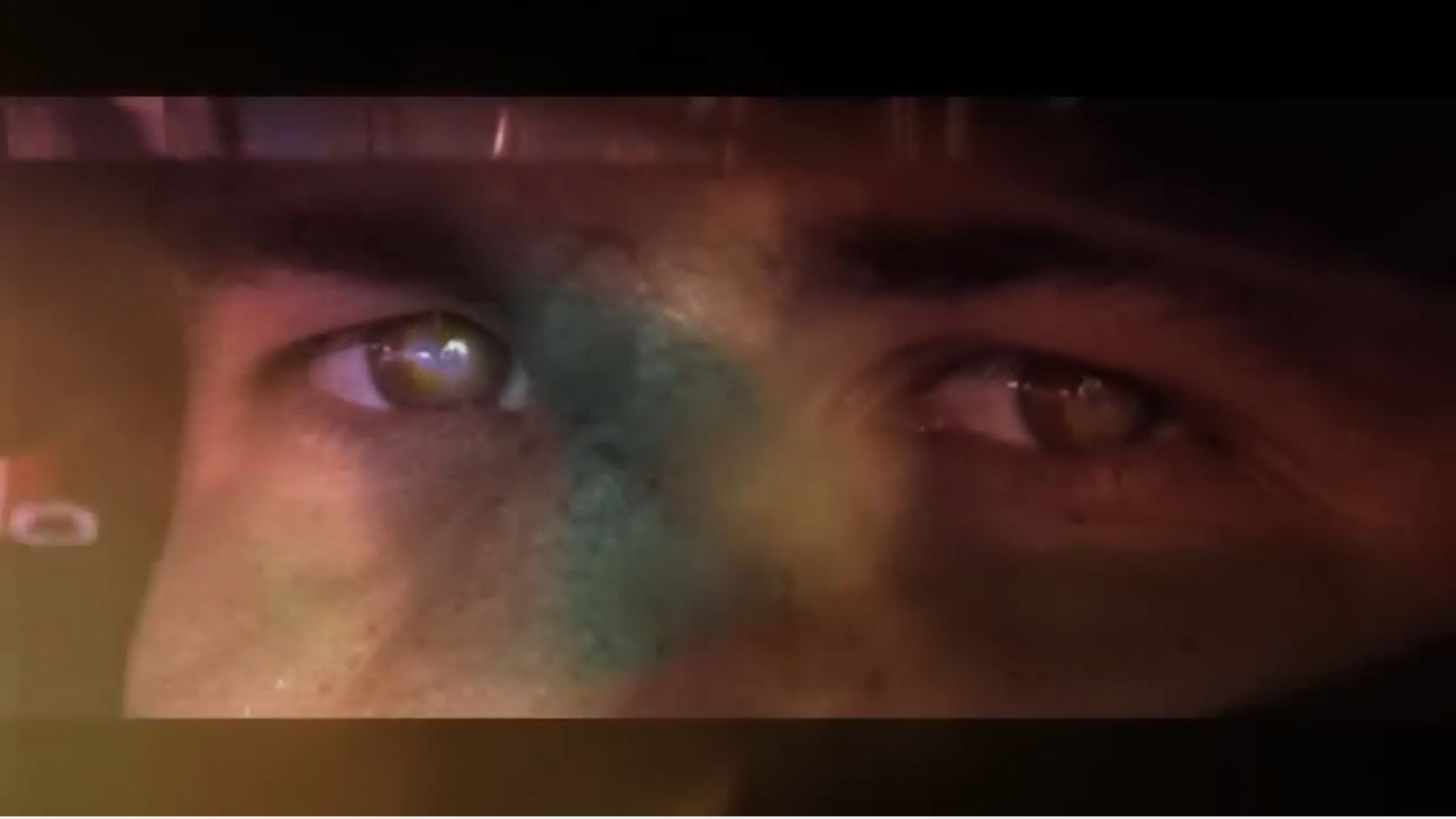
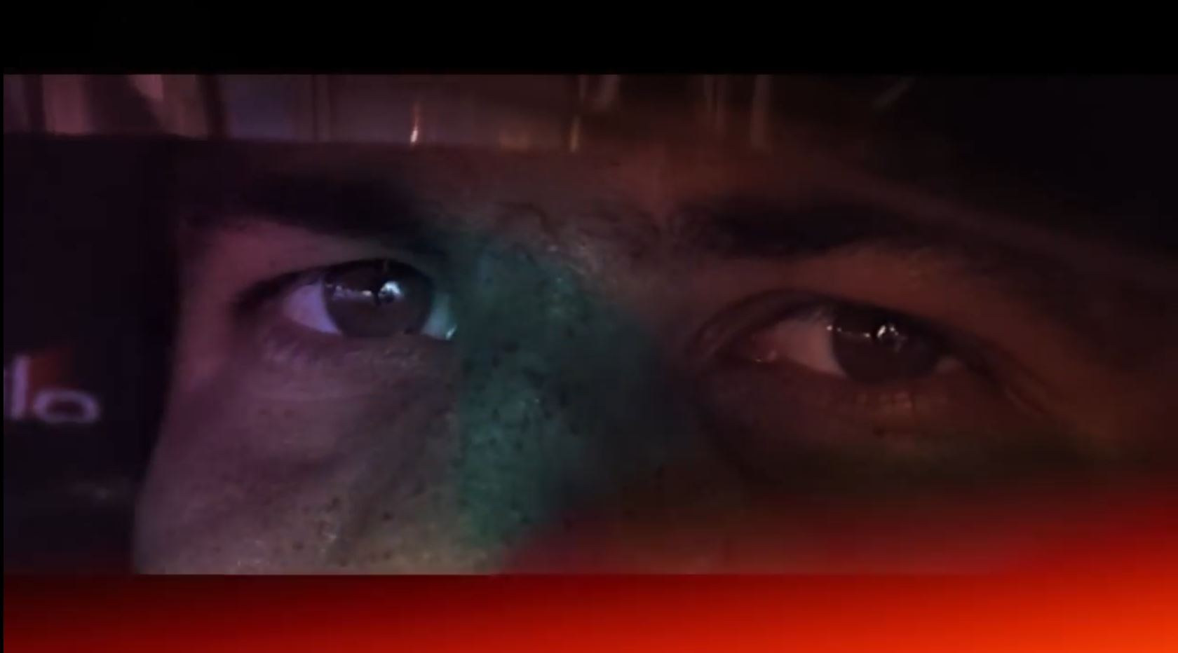
Did you guess a flag? You guys are getting the hang of this. Is it coming across how heavy-handed this commercial is? On the face of it, it just looks like a guy looking at the screen, but you’re understanding subliminals better. FOX’s subtle flag continues to develop and spread as the shot lingers on for a full second.
The red appears as brief flashes on the top then bottom of screen, and colored glow is cast throughout the main screen. His eyes form the main white, and then white lettering will appear in a moment. The blue is interesting because it grows through time and happens in three phases. First the editor quickly sucks the saturation out of the red image. As this happens the blue enlarges in eyes and spreads across the nose. Finally, the image really darkens with subtle blue tones as the blue continues to grow on the nose.
Shot #9
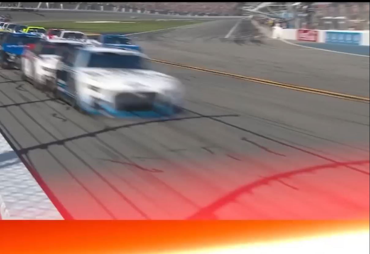
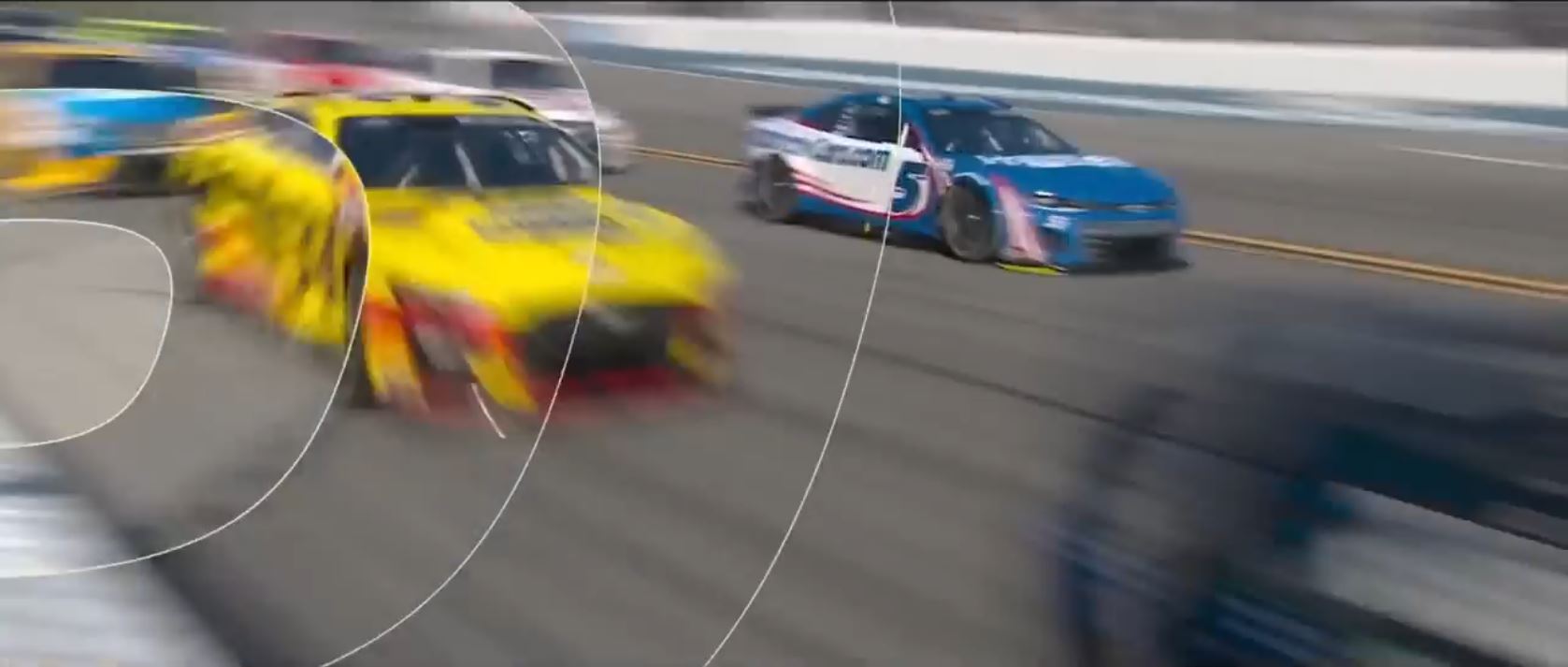
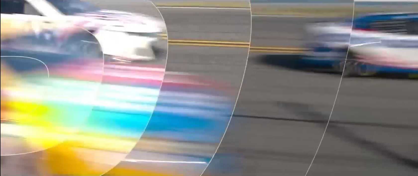
Flags are everywhere. At first glance, it appears to be just cars zooming on a racetrack. We can break this shot into 4 moments and 3 of them have their own individual flags. They last about 7 frames each. It’s super quick work. Work that quick really benefits from the repeated imprint. Maybe that’s why we see three different flags in about half a second.
The first imprint is the wall here. Red, white, and blue, easily. We also got the white stripe of the wall itself, and we have white text spangled upon a field of blue. Then the camera gets swept along with blurry cars and one pops into focus. Is it a yellow or green car? Nope, it’s red, white, and blue. It has red and white stripes on it. It also has a field of blue speckled with white text. The third flag is the following car in the foreground, it is mostly a blurred object, and that really helps the flag be more clearly displayed. I spot red and white stripes. I spot a field of blue, which has white laid throughout it. Getting all these things to line up within microseconds of each other isn’t easy!
Shot #10
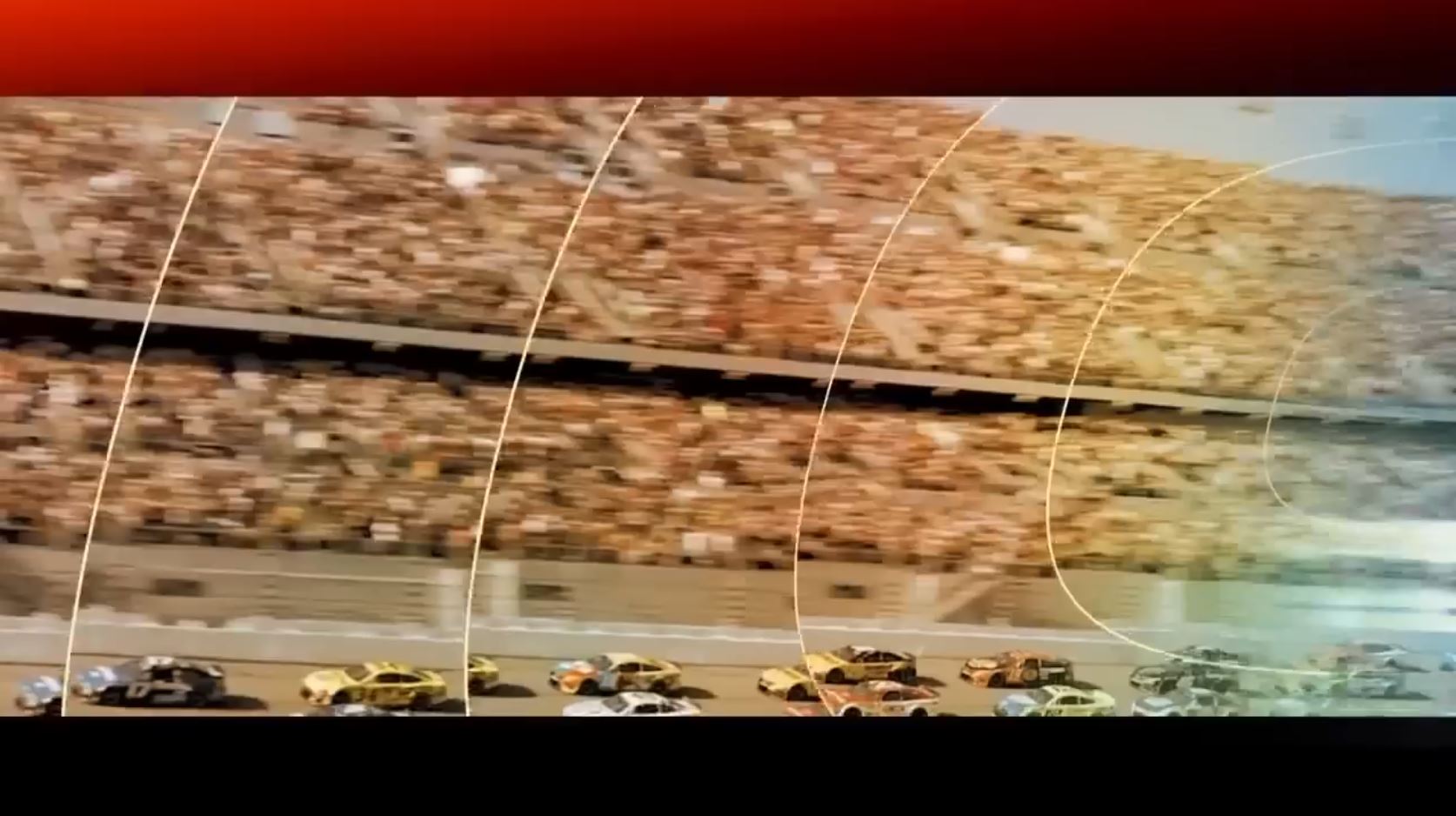
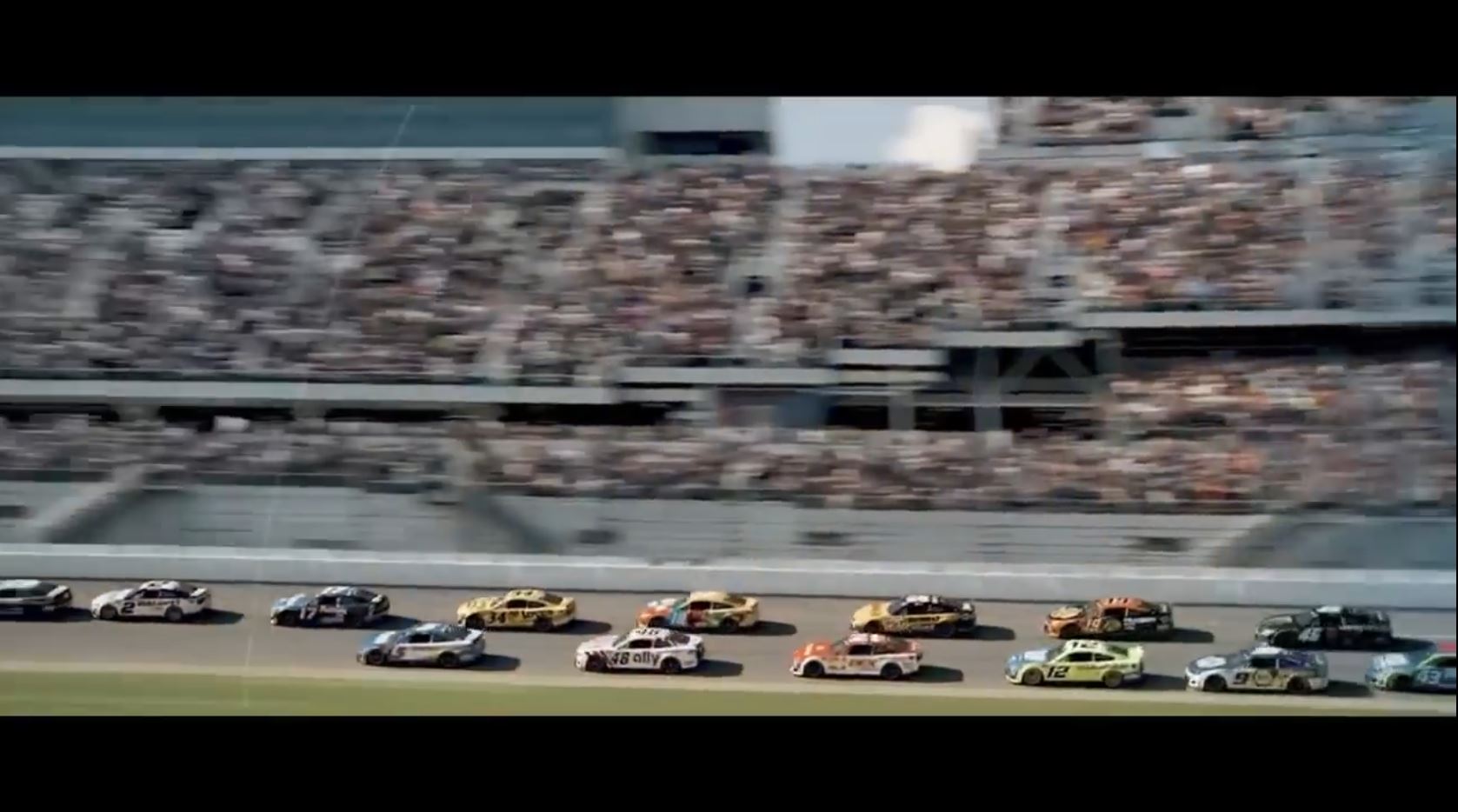
This appears to be just a shot of a filled stadium with racing cars at the bottom. However, it is a flag, which needs elements from the beginning and the end of the shot to be understood by our unconscious. This is another flag that develops through time, even if that time is only 17 frames (half a second).
To make this flag, the editor does the saturation trick which he already used twice this commercial. He starts with the screen really red, saturating the fans in the stands. Then he sucks that saturation out and tweaks up a very blue saturation. We have the white stripes in his special effects concentric circles but also the stands in the moving image. The stars also appear only in the moving image. You’ll see the white hats again, and they seem sparkle with the speed that is swept over them.
Shot #11
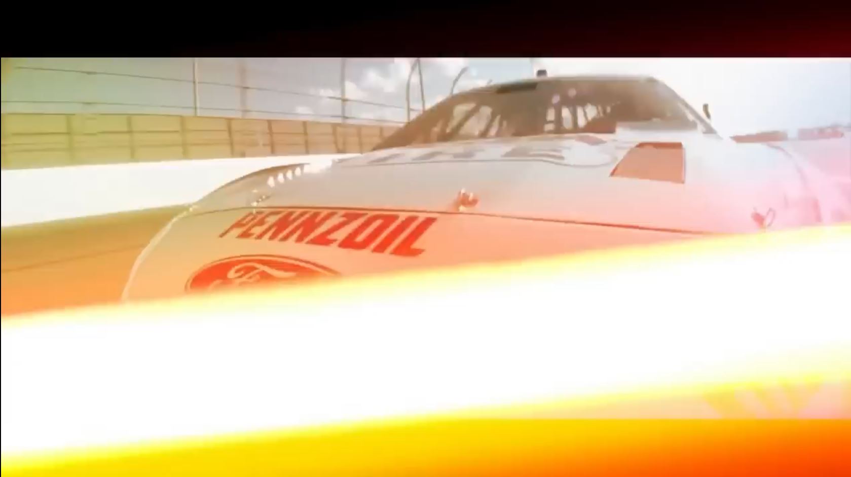
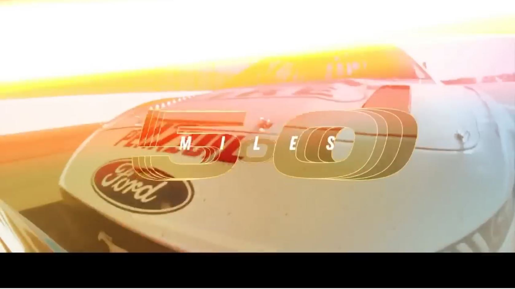
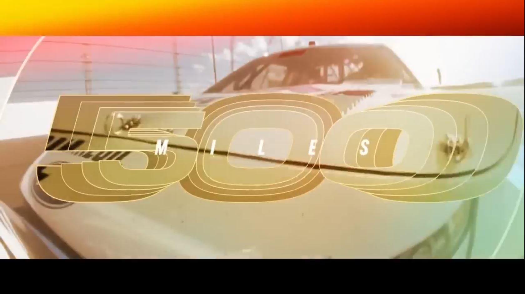
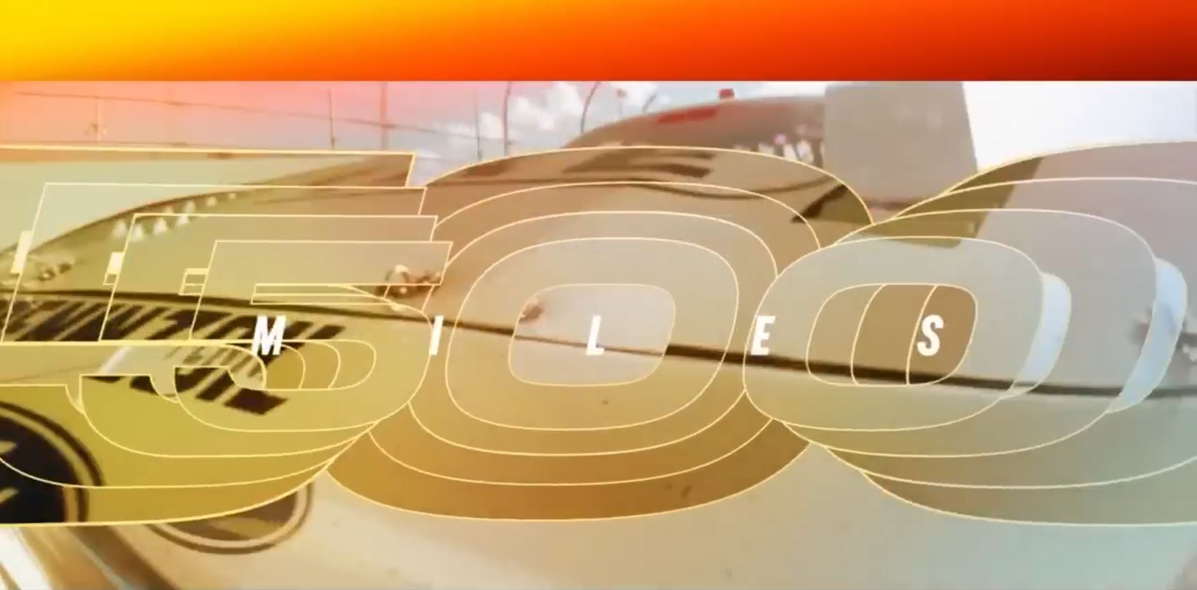
This shot uses a close up of a speeding car, apparently ramming us, to deliver the Patriotic subliminals (mixed with Force). This shot excels in editor after effects to create the subliminal. The screen is mostly a white palette for the editor to paint upon, and he does! It’s mostly a white car and a white wall and a mostly white sky.
In the first frame (the first picture in this shot), his brushstroke is heavy and bold. It’s that laser beam which takes up a 1/3rd of the screen. He’s also painted red the Pennzoil text and logo, which soon turn back to black. The “empty” bar at the bottom glows red. In the next few frames the top bar glows red. That gives us four red stripes. We have two white stripes from the laser beam and the piercing white of the wall. The blue gets really interesting. The simple part of it is the sky, creating a field of blue interspersed with white clouds.
He wrecks his blue in the next moment as another thick laser pulse rips across the sky, turning it red and white. How can he keep the flag subliminal active? He paints something blue! If you look through the car’s window and just beside it, he’s made that area a bold blue. We just tend to ignore it because of the speed and it kind of feels like we’re being blinded by the laser. He painted something else blue it seems. In the bottom left-hand corner, there’s an object bouncing around. Presumably, I think he wants us to interpret it as a car he’s ramming. I’m not convinced it’s a real object. What blue is being reflected onto it from the main car? We can’t find it. This is a very heavily edited shot.
In the third and fourth pic, you’ll find the editor still painting the flag. The laser is gone, so he has to fill in red. He puts it in the subliminal blank bar at the top. He also feels like he has to hit blue more than just the sky. You can see him painting in and around the “0” and “5” of “500.” Those blues are zooming in to us and expanding too. Meanwhile, the mystery object with blue jiggles about as he rams it more. I think these all converge far too beautifully to be accidental.
Shots #12-15
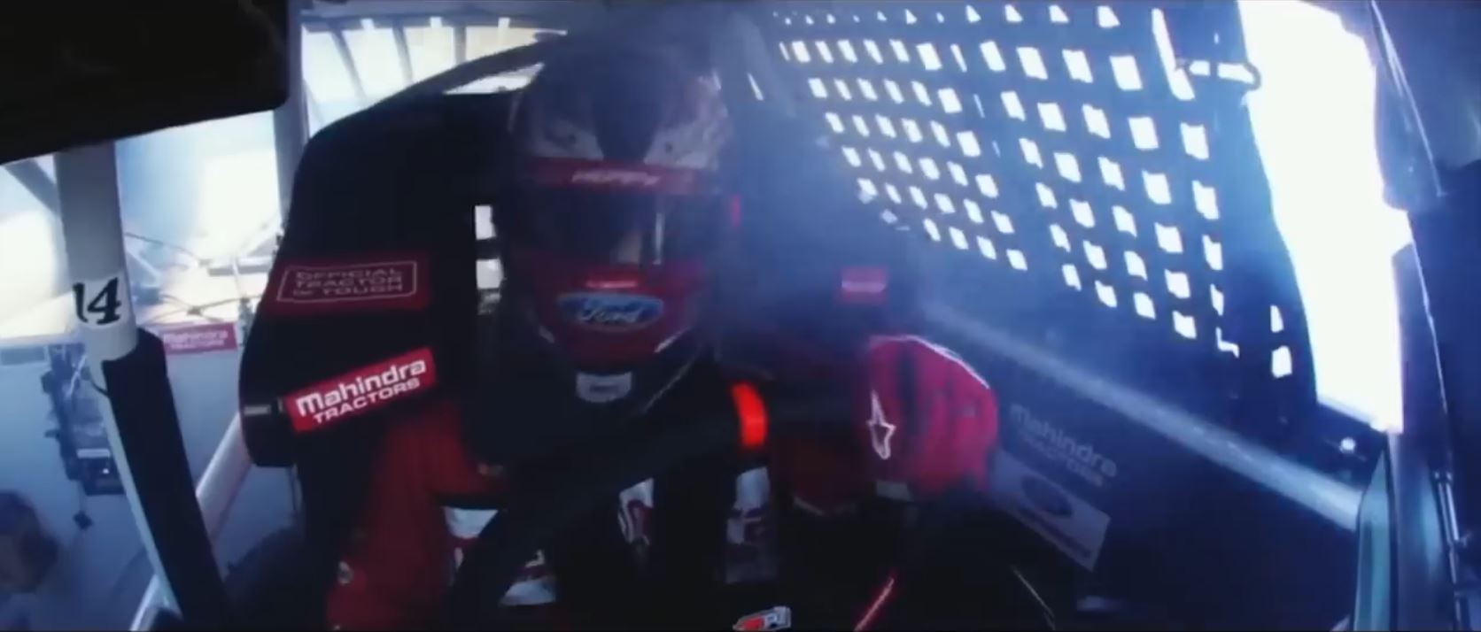
I think you’re understanding the process now, so we’ll cover these next ones quickly.
Through shots #12 & 13, the narrator is saying, “The Great American Race.” This pings Patriotic. He is showing these two red, white, and blue images while he does so. Look at that car, it screams America colors. You could put it in a Patriot Day parade.
Shots #14 & 15 don’t have a flag, surprisingly. Consider this the calm before the storm. He’s going to let those fatiguing neurons rest a moment before he massively lights them.
Shot #16
There isn’t a flag here, but that’s because the editor was very busy showing the logo 8x on the screen here. How many did you think you were looking at? Just the big one?
Shot #17
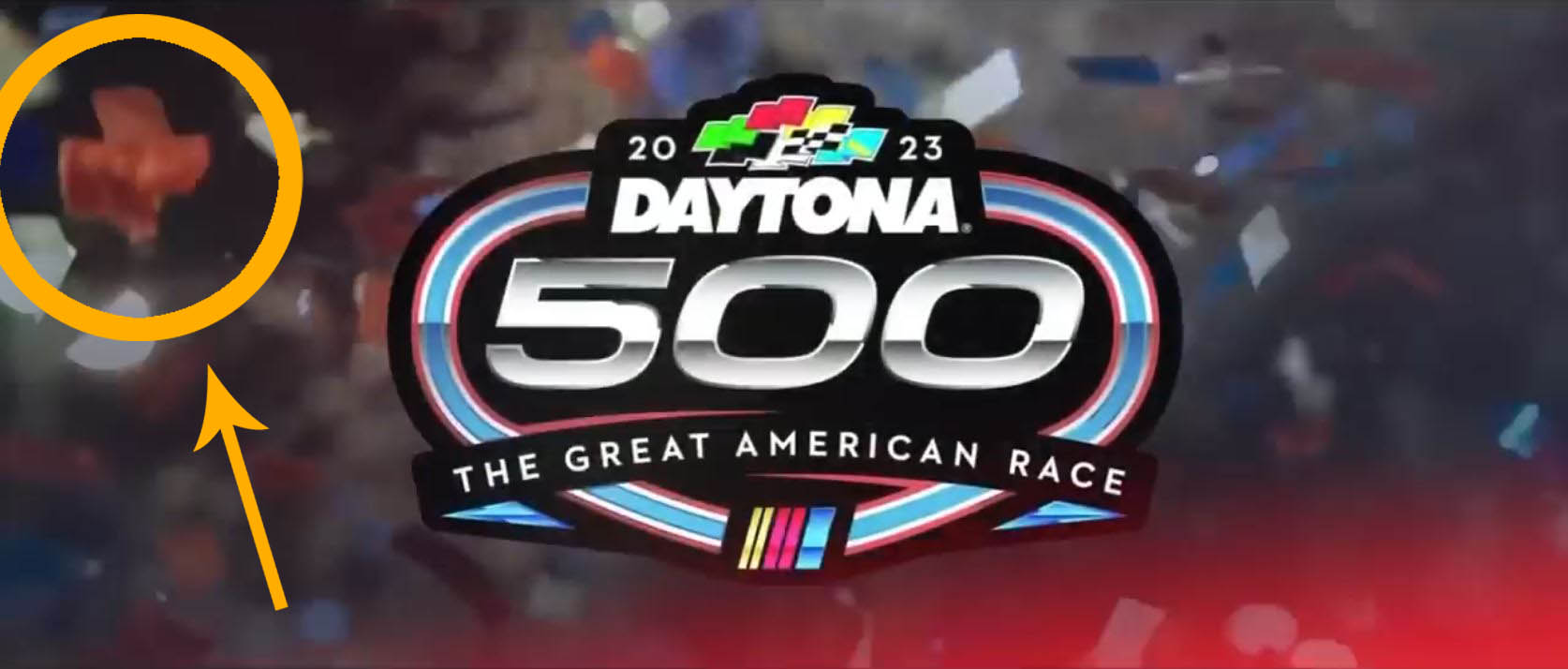
This is the storm after the calm, flag-wise at least. I mean, the editor goes hard at everything he does. He has to carry a change of shirt for when he tries to drink a glass of water. So let’s not think about what happens when he gets drunk! This shot happens during an extended yell from a man accompanied by speeding thrashing garage band noise.
The editor has set up a trance trap for you to fall into. It is the most extreme, intense, and chaotic trance induction that I’ve ever seen. When I do a trance, it is often a slow gentle, “Relax, relax” sort of thing. This editor though, it’s intense. In the midst of the speed thrash and yelling, the large field of falling confetti trances you out. You can’t help it. And it falls with such increasing speed and intensity that the thrash song can barely keep up with it. It’s like this for a very long four seconds. He needs that length for the trance to kick in and the imprint set better. Where most his shots are about 20 frames, this one is over 120, so about 6x the length.
There are three Patriotic impressions, two of which are flags. For the first flag, we see this editor keeping with his same old tricks. The confetti falling red, white, and blue which he did already in the man-on-fire shot. Unlike that prior shot, he has the right amount of blue to not need to fix it up elsewhere like a split screen. He also brings in stars from the lights on the left. It pings you Patriotic easily. Now here’s a curious thing about a single frame in the confetti storm, does this piece strongly resemble Texas?
The second flag is the racetrack border of the logo. The final Patriotic imprint here is the tagline, “The Great American Race.”
Daytona 500 Review
We have just witnessed a very competent editor hone in on so many fine details and get them multi-layered and converging all into a single point, Patriotism. It is all the more incredible because every shot is also selling a great deal of Force, as we analyzed earlier. Both of these light people up. So what happens when they fire together enough that Force & Patriotism become neurologically paired? That is, when one fires the other will too as it’s been trained to do. How much is needed for it to appear in our thought, speech, or behavior? It’s really important to know what imprints we are getting from these hidden subliminals.
What does Patriotism subliminals look like when FOX isn’t doing it? We’ll look at two examples.
Patriotism #5: RAM, “Honor”
This is a quick one. I’ve looked at other RAM ads, and they don’t hit Patriotism as brand like FOX does. However, this particular ad does. It’s a flag that somethings going on. So I looked into it. Stapleton is the national anthem guy this year. He is leading and unifying the entire stadium and the 113 million viewers in patriotic song. In the commercial itself, we learn that all the driving shots was him on way to park under the stadium to walk onto the field. There’s momentum, and RAM is decided to roll with it and increase it. Stapleton leading the anthem is going to give people such a strong imprint, might as well blend that power into your product for a moment. It’s ball already rolling, and maybe it’s even more of an alley-oop into a slam dunk.
You see, these things aren’t always obvious. Stapleton himself becomes an American emblem with subliminal power and effect, temporarily. If you weren’t there, you wouldn’t know. Isn’t it amazing what you can miss if you just watch these ads like a normal person? Many ads are literally designed to get over on regular folk and induce behaviour like some zombie cordycep. This particular ad is more gentle because they don’t brand themselves as patriotic. Let’s look at what they did though.
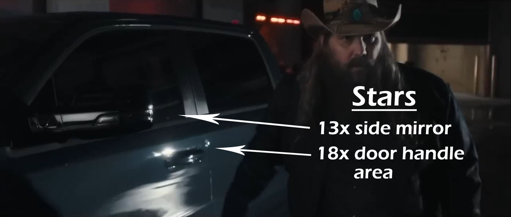
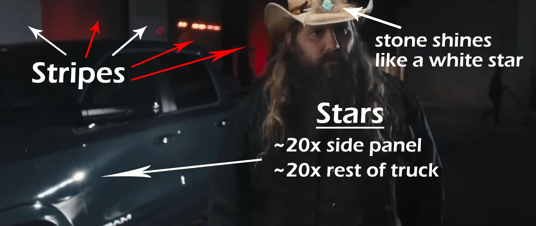
The pic above is the first Patriotic subliminal of the ad, and it appears near the end. Theres the red and white stripes behind the truck. There’s the large field of blueness of his truck, spangled with many white shining lights. A quick sloppy count gets us like 50, and we could probably wrangle a few more easily. (The stars appear and disappear as the camera moves). The amount is really surprising, right?
The second patriotic subliminal happens when he says, “America.” That line though is doing some nice hypnotic-like effect. I’ll give you full line in a moment. It has a specific technique many hypnotists us in their sessions, and it’s drawn from legendary hypnotist, Milton Erickson. Basically, you kind of mash two sentences together and carry on like it never happened. The magic upon the listener’s unconscious happens in the junction. You ever play a video game and your attention gets pulled over to a wall in it and you’re like, “I know there’s something behind there.” There’s something off about the wall, but it might be hard to say what at first. That happens to the unconscious with this mashed sentence structure. Our mind kind of fiddles with it for a bit and takes it deeper than you realize.
Here’s the line in the ad: “It says even more [pause] about where you’re headed next [pause] America [pause] here we come.” In written speech, that looks funny because we use silent markers like commas and periods to be precise about what we mean. Oral speech lacks that, so we guess. That is to say our unconscious does a whole lot of work trying to untangle what is meant. A good mind manipulator can finesse the uncertainty to mean several things at once, which then somewhat sneaks by the usual protocols we have to resist influence. Again, this is super common stuff in hypnosis sessions and a tool in the mashing up of sentences.
In the spoken line, vagueness forces our unconscious to parse it in at least two ways, depending on where you put the commas and periods: (1) you’re headed to America; (2) America, here you come. “America” is the junction spot.
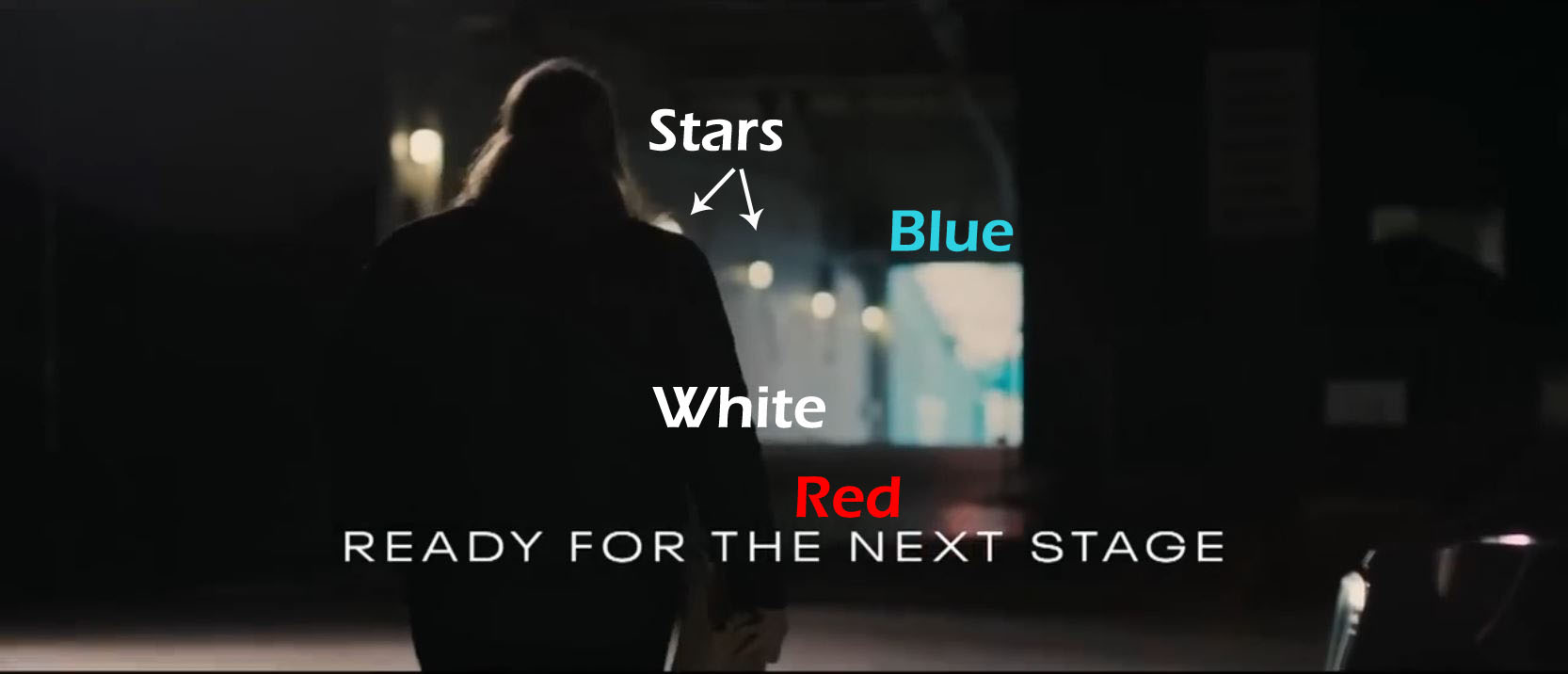
The 3rd patriotic subliminal is another subtle flag. The doorway is the focal point of the shot. The flag unfurls from here, each color and element in another direction. We have a nice blue wall outside touching the door. We have a nice white stripe of a wall inside touching the door. We have red light cast on the floor leading up to and touching the door. There are no other colors. We also have stars which are the several white lamps, also leading up to and touching the door. I’m always really impressed with the detail of these things.
Patriotism #6: WeatherTech
WeatherTech is wonderfully “America.” They stick their flag in it and proclaim it loudly. In this 30 second spot, I counted 8 overt actual flags and 5 oral instances of America in different ways (like the States, US, etc). Plus, the whole thrust of the commercial is that they insisted they be thoroughly American when everyone else told them, “No.” When a brand is really above the table dealing like this, I personally think it’s ok to toss some subliminals in. It works like a highlighter in a book. It’s not sneaking in anything new or hidden, just emphasizing what’s being said. If you reject the plainly stated premise, the subliminals don’t really work then (depending). In fact, they can have the opposite effect of ruining the brand.
WeatherTech specializes in selling you whatever comes out of their plastic molds. Door mats, car mats, dog bowls.
We’ll first look at the Hero’s Journey and then the visual and verbal subliminals.
The Hero’s Journey
This is a top level use of story to craft a subliminal. We have tendency to root for the underdog, to cheer for David over Goliath. So the question arises, how can a Goliath market himself as the little guy but still have us cheer when he reveals himself? He can take us on a journey. In short, the director presents WeatherTech as the underdog everyone said “No” to while blending us, the viewer, into them. This is exceedingly clever because, when WeatherTech transforms into the juggernaut that it is, *we* are transformed along with it. We like it. We like it even more as he has us spread the wealth of that success with our in-group.
Wouldn’t it be a much different story if we first met WeatherTech as it currently is? It is a hulking giant with about $800 million in annual sales, and growing. The founder, David MacNeil, recently bought a condo at the Four Seasons for $6.2 million.
As refresh of a quick Hero’s Journey: (1) the hero sets out; (2) faces adversity and fails; (3) overcomes it and transforms; (4) returns to his village where the boon is shared.
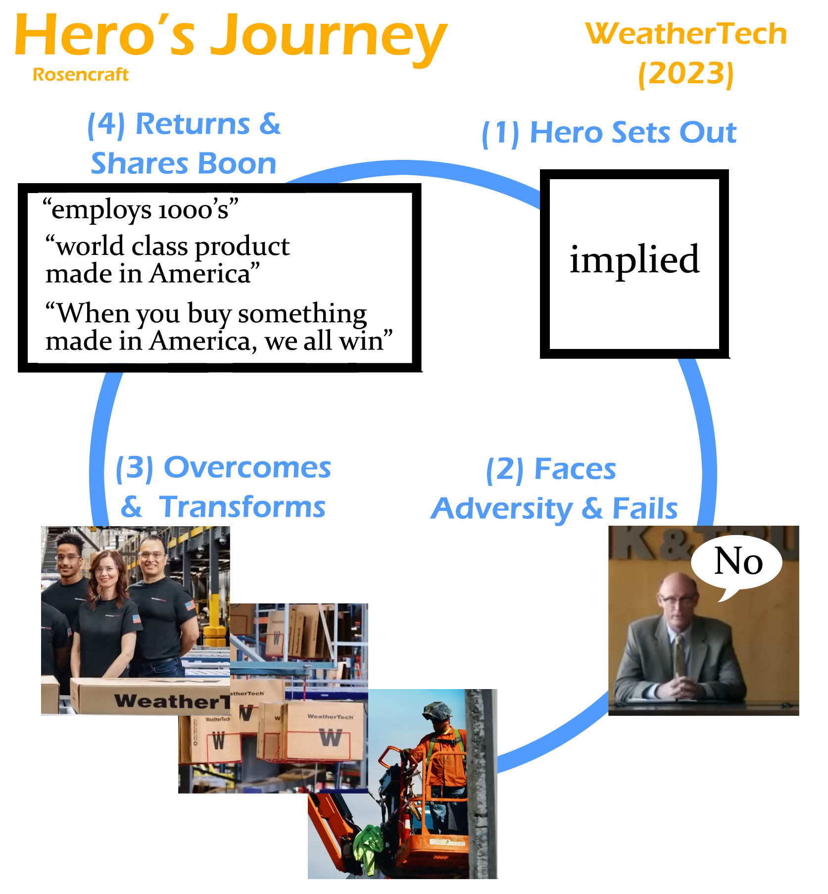
We start the Journey already at the first obstacle, Step #2. The Journey always has us fail the first obstacles. The director instantly sets us viewers as the hero, but the unspoken rule is that we can never hear the hero’s voice because that would mismatch and eject us out of the experience. So, the director has a series of professionals tell us “You can’t do that.” It’s stuff like we can’t have a loan, can’t build a factory in America, you can’t hire Americans, etc.
We are brought into being the hero by several elements: the point of view of camera (1st person); by the professionals directly addressing us; by us being portrayed as the underdog; and a trick that really yanks some people hard. Some hate being told, “You can’t do that” so much that they will enjoy a misery just to fight against it. It’s going to really pull those in, and the general person too, but more gently. You can see there are multiples techniques and angles that all converge into one spot, making us become the hero. It’s essential for the ad to work.

It is so essential that they spent 1/2 the commercial on cementing that in us. That’s 15 seconds or 3.5 million dollars. You get a different feel for the commercial once you know these things, like watching a magician stuff the doves up his sleeves.
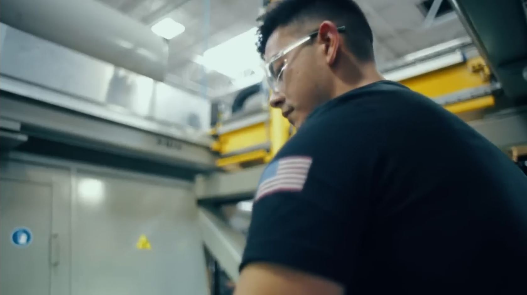
Ok, so we’re the hero now. How do they work the transformation? They intersperse videos of construction sites around the professionals telling us “No.” It’s literally video of WeatherTech building a factory (an expansion of their Chicago campus). They add in the audio, “Experts claim we couldn’t do what we did.” When the professionals tell us we can’t hire workers in America, they flash us into the fully built and functioning factory with an employee working heavy machinery. Of course, he’s got a flag on his arm.
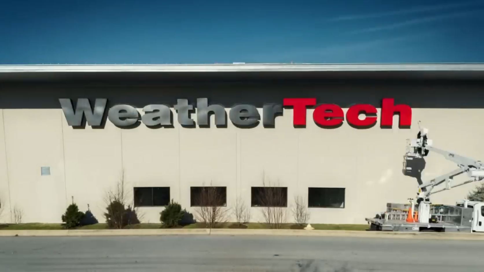
We’re touching Step #3 now. This is the reveal moment where they come out as a Goliath. They thoroughly lead us though the transformation step by step. The audio guides us, “WeatherTech has been proving them wrong for over 33 years.” During this statement, we get cranes putting up the giant logo on the building wall. A darkened factory floor gets lit up as if the factory is coming to life accompanied by the sound of industrial lights turning on. Plus we get the flag-patch employees working heavy machinery, mentioned before.
Artfully, we are made to feel good about being a Goliath. It’d be much different if they showed the mega-millionaire in his elite $6 million Four Seasons condo talking about his $7 million single commercial and paying $5 million for the name on a race track. However, what they did isn’t dishonest at all. It’s comes to a philosophical question: who are we really? Are we just the aspect we manifest in the moment, or are we the sum of our entire Journey in progress on this planet? Do we know someone better by knowing their history? WeatherTech even ethically brought us up to speed on who they are now. I can see the way they very much shaped us into perceiving them differently, and I stand with them in it. It’s really upfront.
The Journey concludes by returning home transformed and sharing the boon. WeatherTech accomplishes this by saying,”When you buy something made in America, we all win.” Of course this means when you buy WeatherTech, everyone in the village benefits. We/They are fully transformed and are sharing the boon with those at home.
Subliminals Visual and Verbal
What’s notable about this ad is that just about every image is a flag or has a flag in it. They also flash images very quickly, like 30 shots in 30 seconds. Generally, a director does this when he doesn’t want you to consciously process an image, only unconsciously process it. I call this rapid fire planting of subliminals “Speed Seeds.”
The first six seconds of the ad are spent setting up the villain, executives who say you can’t build American. It happens in a brown room with balding and aging men. This sets up the contrast of the many flags and vibrant flag colors shown when WeatherTech starts transforming. The transformations and several trials are interspersed until the factory is fully built.
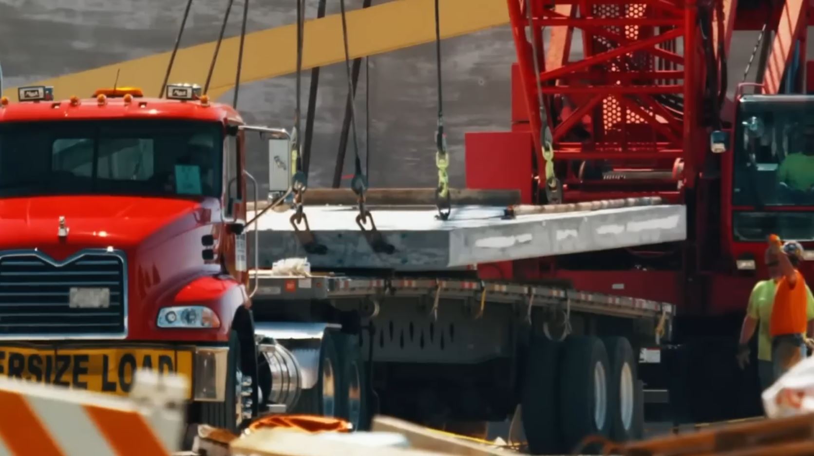
It starts in shot #3, the moment we are flashed into that world of color. The first thing we see is a bright cherry red truck and similar crane filling most the screen. When the color is that striking and dominating of space, it’s a tip off, especially when combined with symmetries. Here, the red is part of a subtle flag. The white is the concrete they are lifting, and it’s also part of a really cool in the unfocused foreground. A lot of subliminal play can happen in unfocused foregrounds because we look past it. We tend to consciously ignore it. It’s like ambient noise we shove out of our awareness when we try to hear someone whisper a secret. So always mark those as an area of interest. Here, we unconsciously render it as having more white than it actually does. It’s a cool trick. I don’t think the director purposefully did it though, yet the effect still happens. The blue appears in the tinted windows on both sides of the screen. They helped us link these colors to Patriotism because two seconds prior they said “America” out loud.
Symmetry is a marker for the unconscious to pay attention. Did you notice the thoroughness of the symmetries in that shot? We pretty much only care about the signal, not the noise. The signal here is flag colors. Those two guys on the right, just noise. However, the red on both edges of the screen is a symmetrical signal. The blue tinted windows touching the the edge of the screen are too. We have white symmetries also touching the edge the screen at the very bottom. Red, white, and blue. Now, here’s the second part.
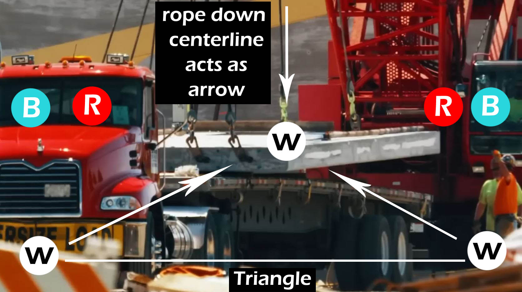
Symmetries can also be used to direct attention to focal point. With all the symmetries literally on the edges of the screen, the focal point has got to be the center. So what’s happening in the center? (1) Story-wise, the factory wall is being lifted and placed. WeatherTech starts its transformation right now. (2) Visually, we have a third splash of white, which creates a triangle, and therefore a focal point at the tip. Let’s count how many focal points are on that slab: (a) the very center of the screen; (b) an arrow pointing at the slab, aka the rope and hook descending down the center; (c) focal point caused by symmetries on the edges; (d) the triangle focal point. That’s four!
Let’s go shot #5. It’s a flag. We’ve got a red crane, white walls, a blue water tower, and blue sky. A second tight flag appears touching the left side of the screen. We have the white hook, the red thing it’s attached to, and the blue thing on the hook.

Shots #6-9 are about 20 frames each. Two of the shots are subtly Patriotic, but let’s focus on the shots #10 and #11.

Shot #10 (above) is great because it has a color deficit that can’t land the flag. The director fixes up that issue, extremely, in the next shot. Looking at #10, we have the white giant slab center screen. We have an abundance of Near Enough red in the orange plus actual red in the crane. We are helped to see this as red as two seconds prior, they said “U.S.” out loud. The blue is deficit. It’s there in the crane window and slightly at the foot of the slab, but it’s too weak to really ring blue as an imprint in the general image. We are about to be drowning in blue in the next shot. Brace yourself.

Shot #11 is thoroughly blue! The director worked that blue so hard that even the papers all over the desk turned blue under his flood of tinted light. Do you think she really has blue paper? Like she arrives to work each day with color coordinated stationary like that girl in “Clueless”? No. It’s a trick to create a subliminal. He also swept blue across window too which takes up 2/3 of the screen. Then he added blue objects into the foreground and background. Rather heavy handed, but nicely done. We’ve also got white stripes in the blinds and then white stars as as sun glares throughout the room. Shot #12 is just a zoom on this image, so even more blue.
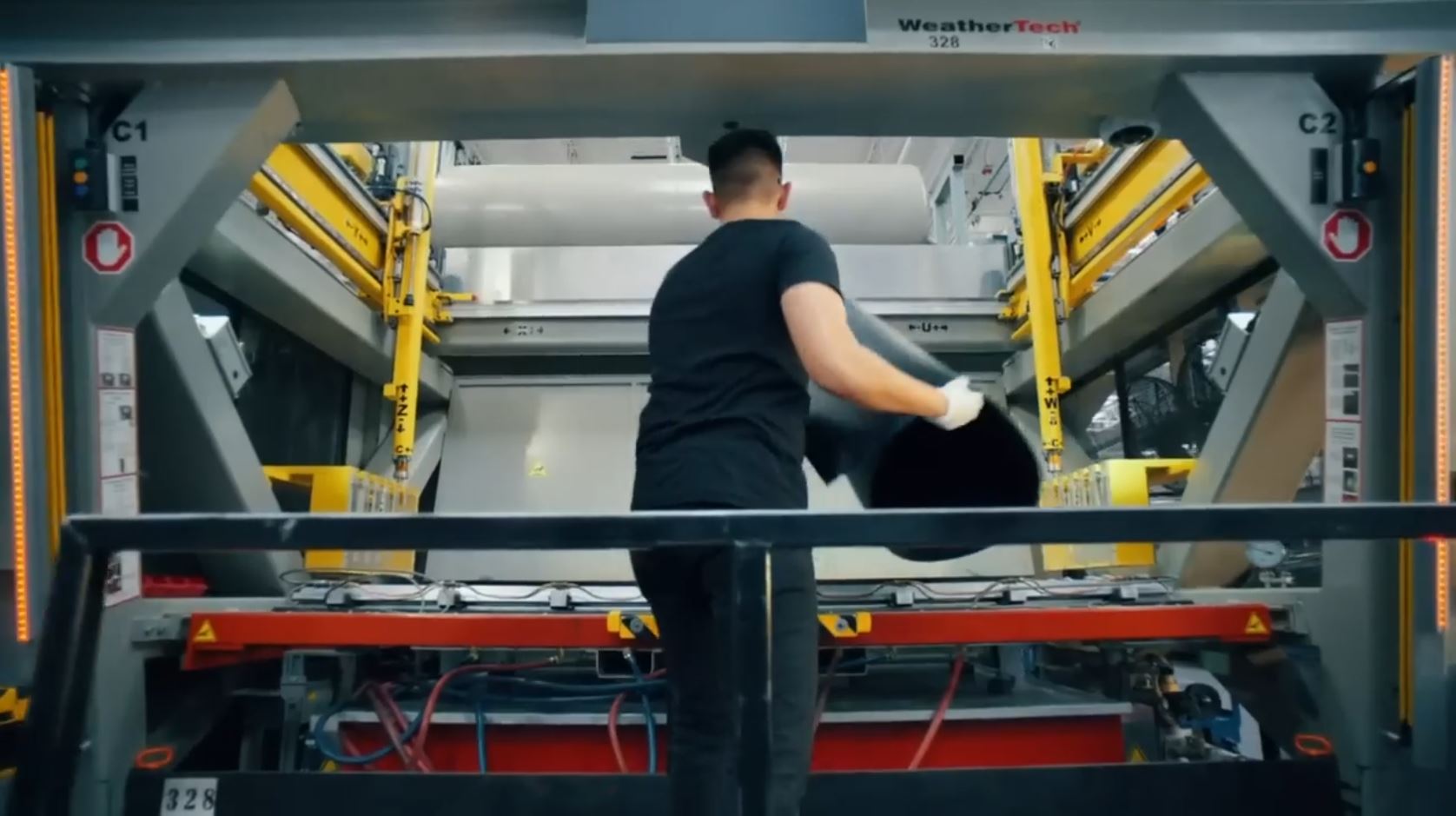
Shot #13 carries over the blue we were just swimming in. It fits neatly as Color Close Enough to the grey we are now swimming in. We mentally render that grey as blue. Then, we’ve got vibrant red and it’s in stripes at the bottom. On the side we’ve got beads of light making the stars. We’ve got white on the ceiling, a bit of the machine, and on the paper on the sides. Here’s a note: from now on, you’ll see threads of yellow through the images. It won’t be the lead color because it’s a motif, not a theme. Yellow in this ad means something like “industrial” or “factory.”
Shot #14 is a close up of this shot. We get an overt American flag center screen. It’s the patch on his arm as part of his work uniform.
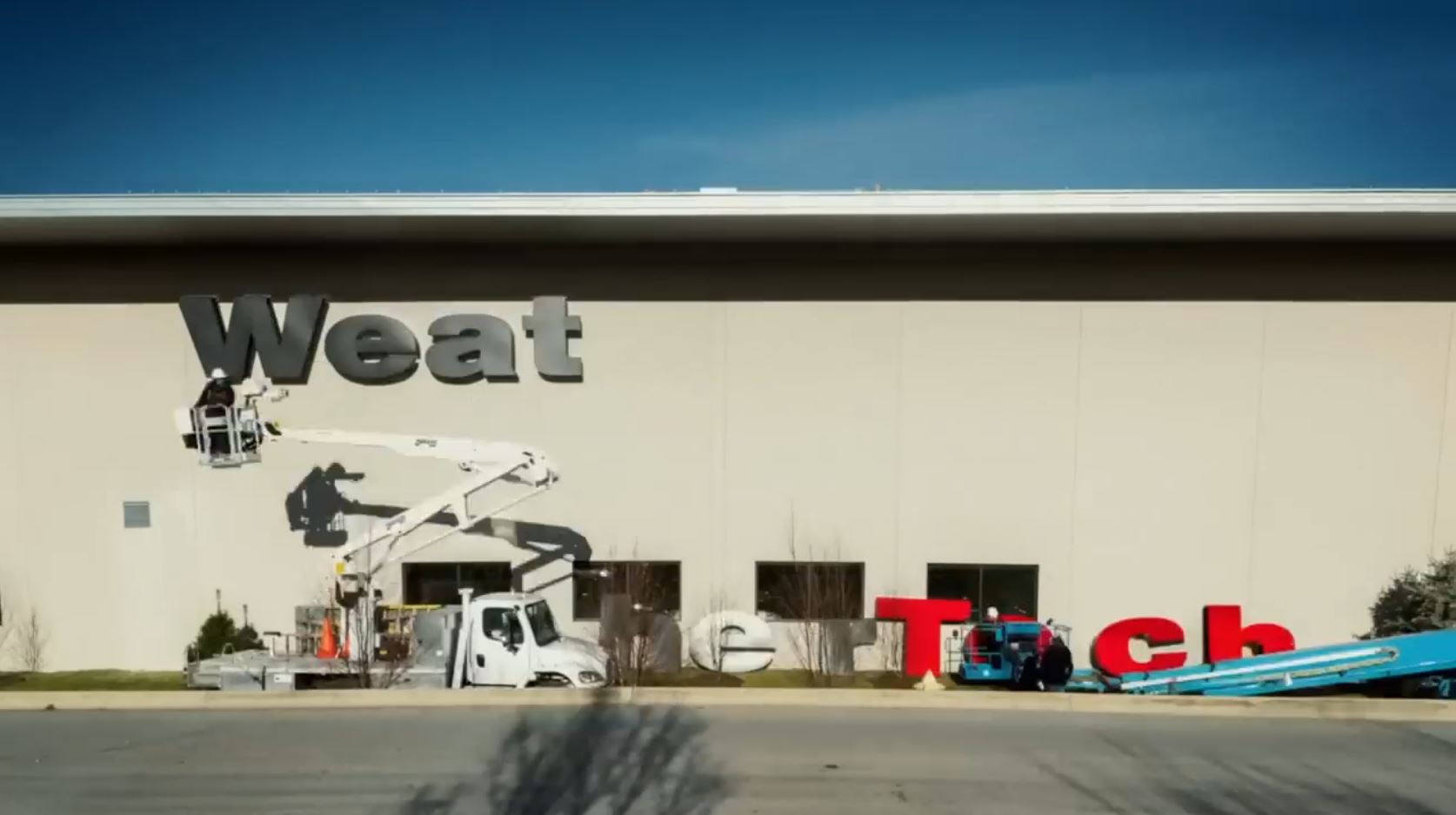
I insist on smiling for shot #15. They actually did do that “Clueless” color-coordinating thing! Look, white crane, blue crane, and you saw the red crane eariler. Color-assessorized to the American flag. In this shot, they use vibrant red letters instead of the third crane.
These are specific items on the screen making a flag, and they also made the image in general give an impression of a flag too. Nice field of blue at the top of the screen. It’s followed by a stripe of white. Then we have a field of off-white which is the building wall. Plus, we have vibrant red of the letters. It’s a double imprint of a flag.
Shot #16 has an American flag in focal point of the shot. It’s huge in scale. The rails and pipes lead us right to it. The flag is also illuminated in the otherwise quite dark image.
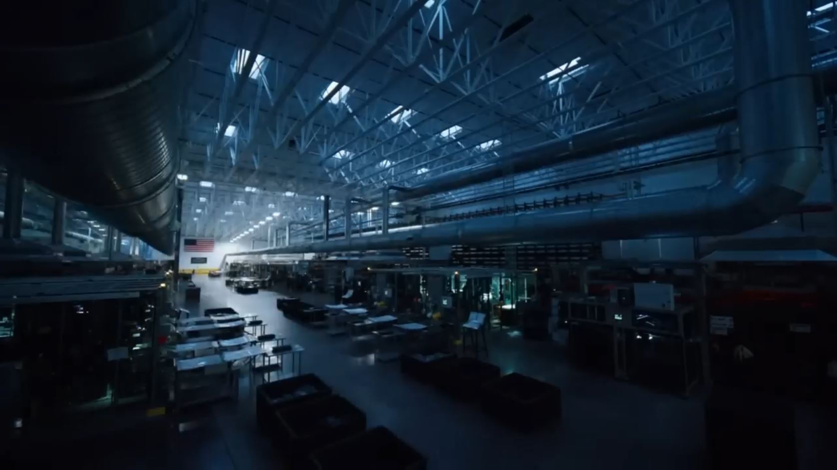
Shot #17 has the factory as a subtle flag, holding, perhaps cradling, WeatherTech in its arms. America itself is packaging WeatherTech for you. Basically, logo’d boxes are being carried by conveyance machine. The factory is painted the color of its soul: red, white, and blue. The factory itself is a subtle flag in addition to the giant overt flags they hang in it. It should be noted that yellow is a lesser color of their soul. It symbolizes their industrious nature as you’ll find it around the heavy machines.

Shot #18 has a hidden trick in it. It’s one of those subliminals that flash into existence for a single frame or so. We get part of an actual flag, partially obscured in the mid-ground behind a mess of machines. Will our mind pick up on it? Yes, the director even helps. The camera is moving into the image at a certain rate. The flag isn’t in sight. The moment the flag becomes identifiable in a freeze frame, that’s when the director ditches his steady speed and zooms the flag right at our face. We get an extra exclamation mark as we are hardwired to emphasize red (danger!) rushing at us.
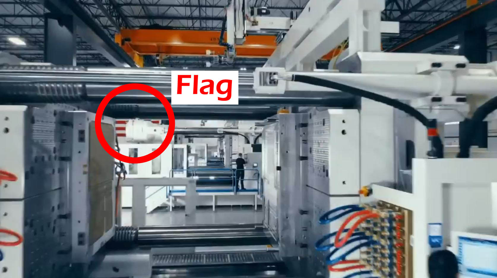
The image also gives us a subtle flag. You’ll see red and blue thick wires. Blue railing focal point and blue computer screen. The orange at top is a not-great as red but kind of helps gives the impression red would in the general impression, helped by the an actual flag in the image. White is everywhere.
Shot #19, bright red continues its leap at our face! It even carries over the location of the leaping flag and a stripe right on the flag stripe too. These sort of jump-at-your-face zoom tricks really emphasize and magnify how we internally render these things. I call it “Exclamation Point by Zoom.” It also carries the danger element of red, mentioned above. Nature uses red as a warning system, often about poisonous venom. So red really gets our attention unconscious attention better than other colors and it can sear into our minds better too. I’ll explain.
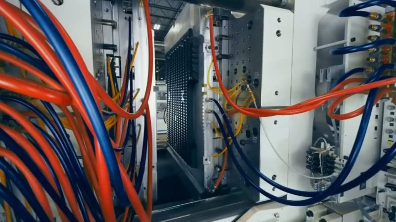
I studied the ancient memory methods of the Greeks in my feat to memorize 25 decks of cards in a single sitting (98% accuracy by the way). One popular way back then was to imagine danger happening to you. They recommended having a sword or spear run through you, in conjunction with another principle. For the flag in this ad, the bad juju of the danger is well worth piercing the flag into your memory. Besides, they have paved over the bad with good associations of the flag in like every single rapid fire shot in this ad.
The image is also a subtle flag. I think you can tell at a glance by now. The shot is a double hit by carrying in the actual flag from the preceding shot and being a subtle flag in itself too.
Shot #21 has more subtle work we all undoubtedly missed, at first. Remember the blue lights he flooded the screen with in the office girl shot? It even turned her papers blue. He’s now shining that blue light on WeatherTech products.
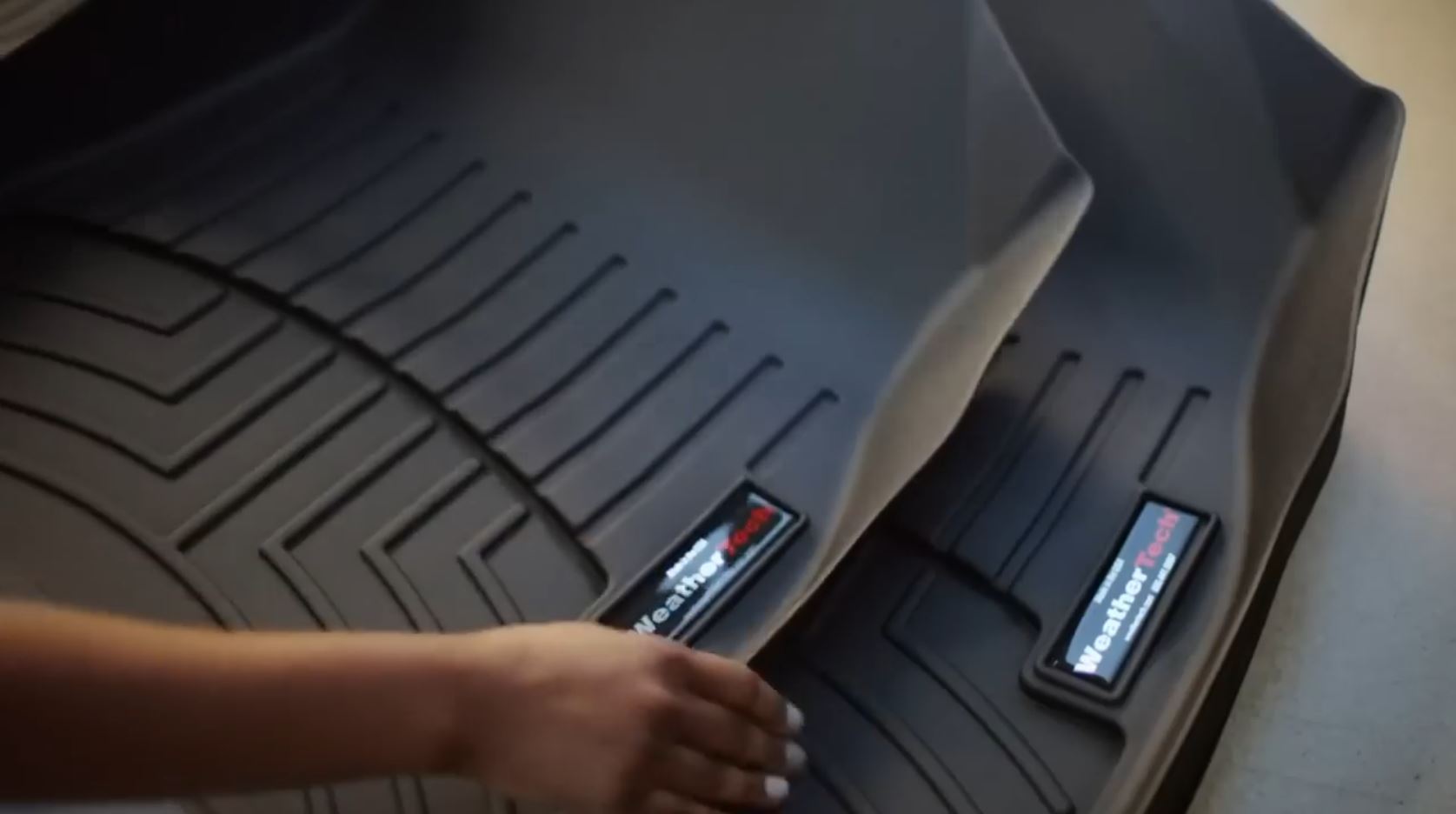
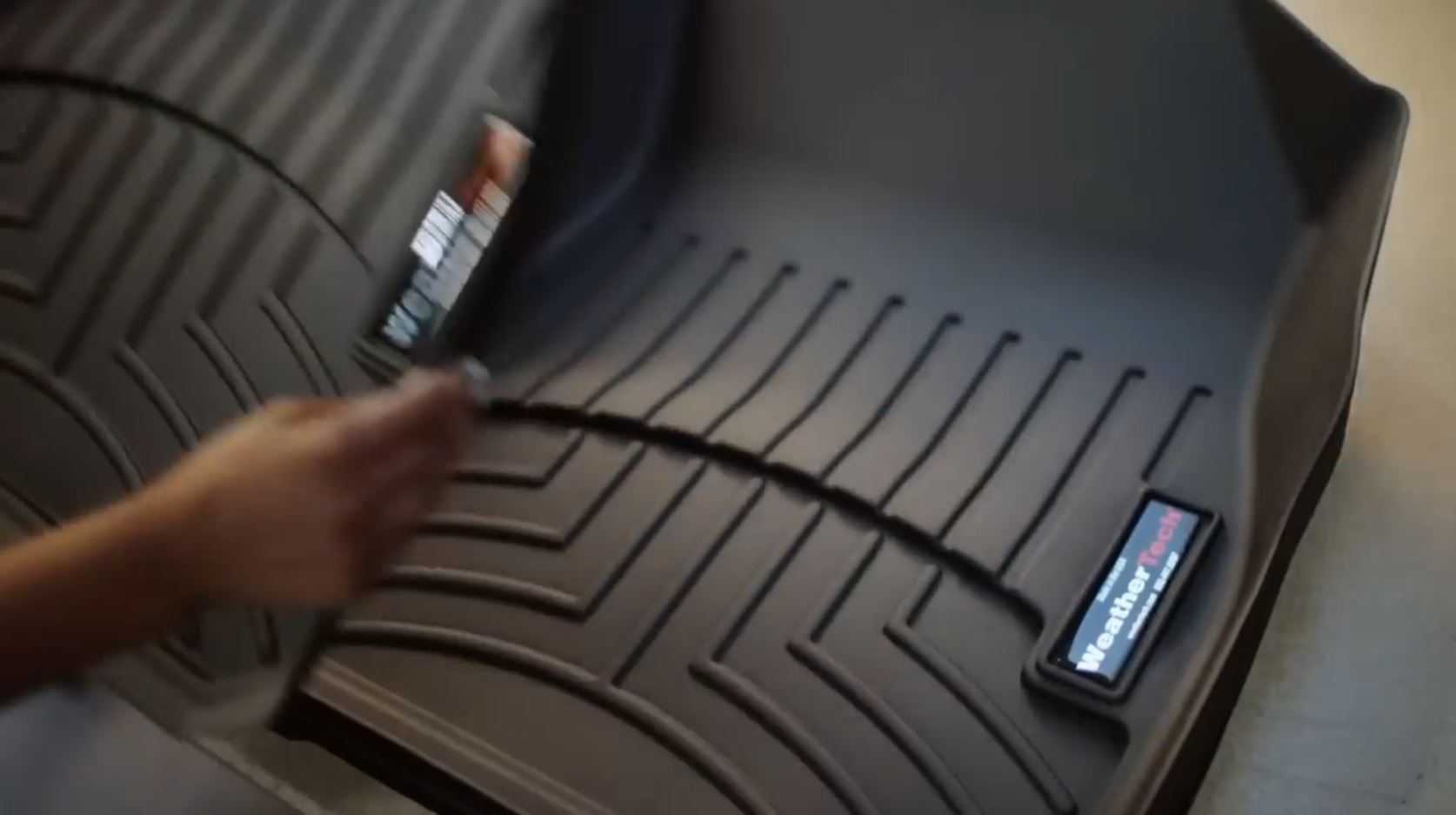
See, the director was faced with a tough challenge. A lot of WeatherTech’s stuff is like grey or black plastic mats. How are you going to show product and get the flag colors in? If the product takes up most of the screen, this is double difficult. He can use the logo to give him a small but vibrant red and white. He has to manufacture the blue then. A comparison image helps us see the blue better. More natural light shows the greyness of the mat underneath.
Images are flying past us really fast now. You can get the patriotic elements in them, but they’re not particularly interesting to talk about
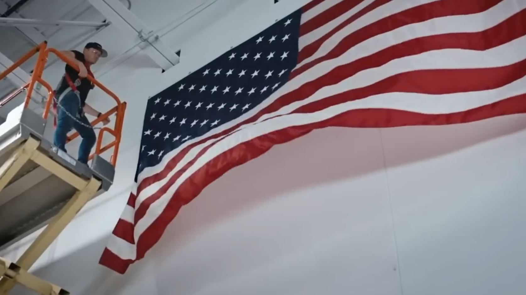
Shot #25 is a giant overt flag several times the length of a man, being unfurled in the factory. The narrator is saying, “Making world-class products, right here in America.” In this one second shot (30 frames), “America” is placed as the flag unfurls. That’s a strong double hit of Patriotism.
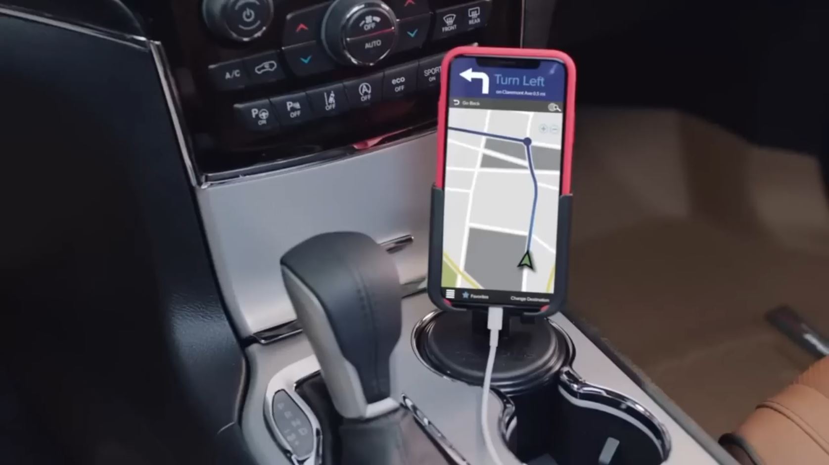
In shot #26, they are showing their phone holder, which is bland, so they had the phone case and app give all the elements of the flag. A more general red, white, and blue is in the background as the car’s control panel.
Shot #27 I like as the director trying to solve another difficult challenge. How can he make a flag out of a standing mat? It’s bland black. I imagine he was just looking around the studio, thinking quick, and said, “Hey, slide over that blue bench. Good. Now you with the white soled shoes, stand on top of the product. Check. Red? Roll our camera equipment dolly over there. It’s got a red splash of tape on it. We’ll put it in the unfocused foreground. Their conscious will probably ignore it entirely. Great! We’ve got a subtle flag now.”
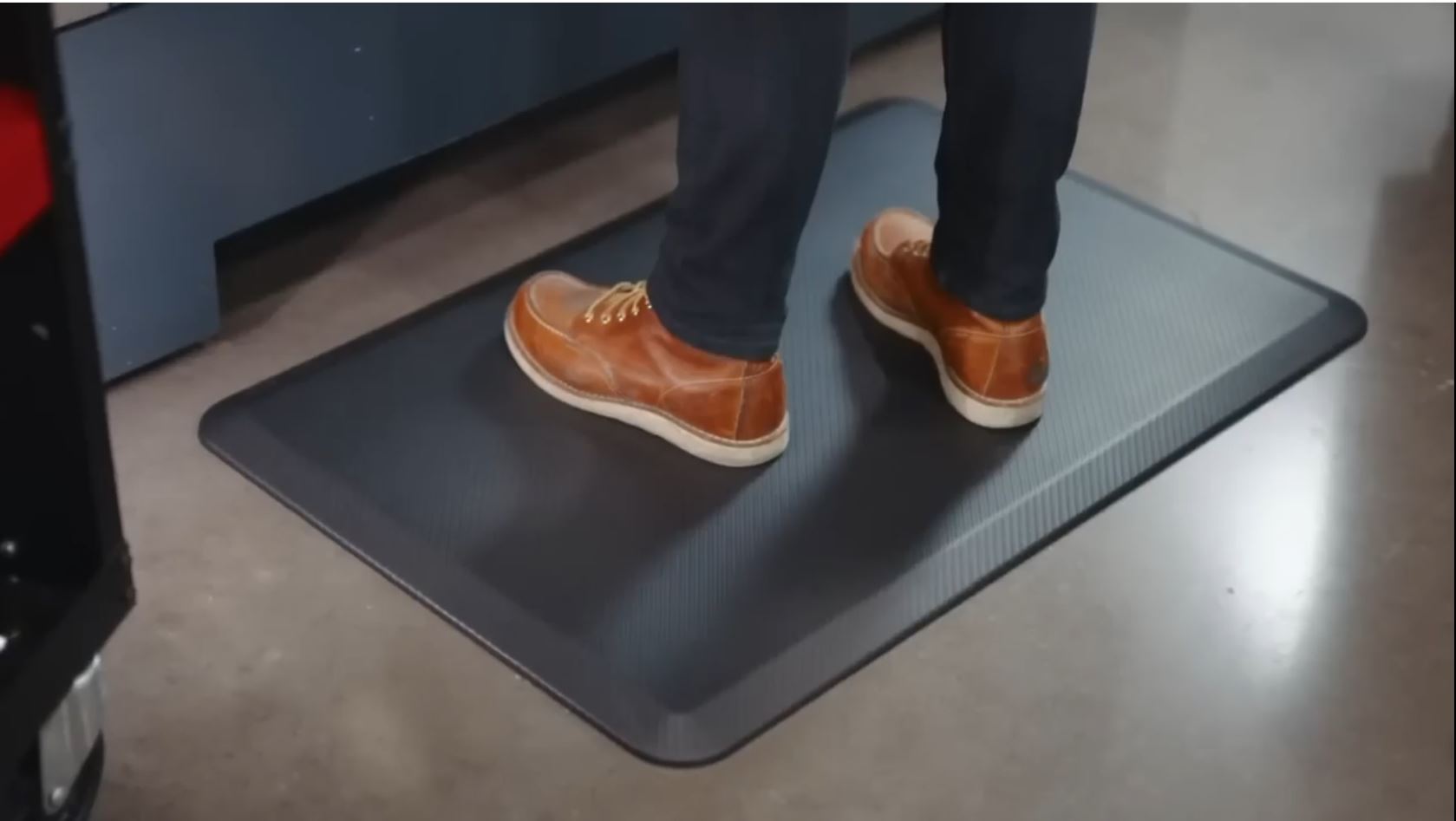
Shot #28 sets up Shot #29. There’s not a flag here, but I wanted to share this cool effect. The director is setting us up for a Carry Over effect into the next shot. They give us a cute Golden Retriever to watch. He chomps happily from a WeatherTech food bowl. The shot lingers on him and we soak in the cuteness. We invite it in. And in doing so we also evoke in us the other qualities of the pup. Loyalty, companionship, protection, etc.


Then, flash! Shot #29. We are taken to the WeatherTech team. Still swimming in all those good associations from the Golden Retriever, the WeatherTech team is now soaked in it too. On the conscious level, we just kind of find them pleasant. That’s because the category of the Golden Retriever is active in us (and the pic is generic nice with smiling faces of approachable people).
There’s other things going on here too. We’ve got three overt American flags. It’s as a patch on their arrms. Impliedly, eight are in the image.
Also, note the symmetries. We’ve got the blue bar on the top and the bottom. Thick black is in both upper corners. We’ve got blue and silver rollers on both sides. The short guy is in the middle of the shot and in the middle of the group. It’s not a perfect middle, but they kept this lopsidedness throughout. You can see it in foreground cardboard boxes and the background white wall where it splits by the black line. These slight askew images add interest to the unconscious so it analyzes them a bit more. It’s good work. The conscious mind likes the super precise stuff, but the unconscious is built differently.
The final image, Shot #30, gives us a prominent overt flag right next to the WeatherTech logo.
